3. Semiotics

gclassen
Posts: 9
Joined: Thu Sep 30, 2010 7:20 am

Re: 3. Semiotics

Post by gclassen » Thu Oct 14, 2010 8:49 am

Image
vbvoyeur_400 by gclassen, on Flickr

I chose Victor Burgin's "Gratification" as my image for the semiotics project. In this photograph, the viewer is being transported into the photographer's shoes, staring into a neighbor's brightly lit home where a woman is walking around naked. We get a sense of voyeurism and the morality of if the photographer had permission to shoot this subject or if he's being just a peeping tom comes into play. Compositionally, the woman is the center of the photograph. Yet, her head is cropped out. She is looking directly at the camera, her full frontal body exposed and is almost frozen in time. We wonder if the photograph has been waiting in that spot for some time, hoping for the right moment to snap the picture. Yet why is this woman walking around fully naked in a brightly lit home, and not have the common sense to shut the drapes. It's almost as if she wants people to see her. It's an interesting picture that brings up a lot of questions.

Manie06
Posts: 12
Joined: Mon Sep 27, 2010 10:34 am

Re: 3. Semiotics

Post by Manie06 » Thu Oct 14, 2010 9:05 am

Semiotics
The article claims that we assume a given image with an attached text has the linguistic message attached to it as to explain the image or help the decoding process calling this relationship harmonious. On the other hand, there exists some images that become more abstract with a linguistic message attached to it and harder to decode, making this explication by the text and illustration by the image a not so harmonious relationship. An image is like language because it does convey a message, but if text is added to the image that message become a metaphor. As an example the image of possession from the article can facilitate this transformation from message to metaphor. Taking the image with out the text the message it conveys can be that of passion, sexual or love. If the image is taken with only the first half of the text it further reinforces the message of passion, lust and maybe even unhealthy love. Finally if the image is taken with the complete text, the whole message is transformed into something abstract that obviously means more than just what the image can convey for itself.
Attachments
semiotics1.jpg
semiotics2.jpg
semiotics.jpg

amandaziegler
Posts: 9
Joined: Wed Sep 29, 2010 10:53 am

Re: 3. Semiotics

Post by amandaziegler » Thu Oct 14, 2010 9:49 am

George L. Dillon offers many different situations where image and text work together, whether the image is supporting the text or the text is supporting what the image is attempting to articulate. Dillon goes on to say that “when an image is used in a textbook or a treatise, assume it is there to illustrate and support the meanings and information provided by the text. When an image occurs in an advertisement, assume it is there to help sell a product.” http://faculty.washington.edu/dillon/rh ... gsave.htmlDillon states that advertisements use relations of explications, which is the text, along with an illustration, which is the image. I think this is an interesting concept because often times in textbooks, it is page after page of hard information and statistics or anecdotes. This can become monotonous and hard to understand. However, when the text is split up by different images used, it allows the reader to react, interpret or respond to what the text is correlating with the image. Images or illustrations often produce emotional reactions within the viewer and that may be what is necessary for the viewer to digest the information being transferred within the text.

Dillon’s next point, which stated that images occur in advertisements to help sell products, is also accurate because in order to convey a positive reaction out of an audience (which would be to buy and/or support the product being streamlined), the audience wants to see how the product will better their lives.

Image


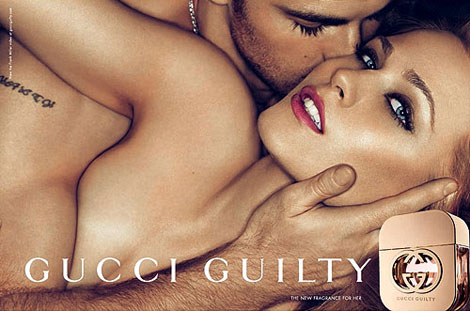
For example, in the Gucci perfume ad for “Her,” the corporation is presenting an advertisement for female’s for a perfume titled Guilty. The ad depicts an attractive female entangled with an equally attractive male who is consumed by her aroma and is kissing her cheek. The ad uses this image to attract female’s to buy and wear their perfume because if they do, they will be as beautiful, alluring, and wanted as the woman pictured in the advertisement is. This ad is powered by this erotic and inviting image, but the text is supporting the image because the title of the perfume is Gucci Guilty—the title of the perfume makes the image make sense and the ad as whole come together.

Dillon poses three questions in his text:
1. how language-like are images?
2.how do images and words work when they are both present?
3.how do scenes of people gazing and posing convey visual meaning?
http://faculty.washington.edu/dillon/rh ... gsave.html

I think the advertisement example i offered gives a strong example of how text and image can work together to infer a message in a strong manner. If the image was alone, it could be interpreted in many other ways, mostly of an erotic nature. Likewise, if the text was to stand alone and just say "Gucci Guilty," the audience would not have any information as to what the perfume offers to them. When both the text and the image are sen together, the audience is able to infer that one, Gucci is promoting a perfume for women that alludes to an alluring and sexual encounter when a user of the perfume is wearing it, and two, that this is an advertisement for a perfume and not just an erotic photograph.

tcecchine
Posts: 12
Joined: Tue Oct 12, 2010 8:26 pm

Re: 3. Semiotics

Post by tcecchine » Mon Oct 18, 2010 9:41 pm

Semiotics.
IN the text by Dillon, there are several ways in which ads are directly involved with all the ways one can read an image. They are explicitly important because they are aimed at a specific population and must find something that will hook that audience and convince them into buying the product, or feeling they truly need to have whatever the thing is trying to be scammed off. I chose this ad for Carl's Jr, that Paris Hilton posed for, along with the series of commercial shoots she did for the fast food franchise chain. This example is exactly what the text is referring to in terms of the messages being misread, and the context placed a specific way, as she eats with her eyes closed, a face full of make up, and the most sensual of expressions. This is not really how every one eating a hamburger looks, but with this sex appeal she is able to take the attention from the product and again make it about sex. The concepts in the image, or the ad, are often times not even truly related to the product, and that here is surely the same case.
Attachments
semiotic image.jpg

Stephanie_V
Posts: 8
Joined: Sat Oct 02, 2010 10:00 am

Re: 3. Semiotics

Post by Stephanie_V » Sun Nov 21, 2010 3:45 pm

Dillon asks 3 questions in his article, one of which asks how an image directly involving the viewer conveys meanings. What really interested me is including the viewer in the image, such as Eduoard Manet's The Bar at the Folies-Bergère.

Image

One might assume that the image of the bartender's back is a reflection, which can only mean the viewer is represented by the man on the right, wearing a hat. However, the angles are not accurate; compare the distance between the woman and bottles in the foreground to that of the reflection, and it does not quite add up. Is that really a reflection of a bartender interacting with the viewer? Or is it perhaps a reflection that occured at a different time (thus, relieving us of taking on the role of the man). We may be getting a glimpse of a previous (or future) customer. These unanswered questions allow for a variety of meanings that can be conveyed by this painting.

danecsmith
Posts: 10
Joined: Wed Sep 29, 2010 3:40 pm

Re: 3. Semiotics

Post by danecsmith » Sun Nov 28, 2010 5:46 pm

In this article, Dillion brings up three main concepts. The first being the indeterminacy of image meanings. Essentially this is how the image is composed and the parallels and differences between image and text of natural language. Images are more susceptible to the viewers interpretations and preconceived notions, while text leans less on the viewers interpretations of what is being viewed. He also explains that in most cases the meaning that is trying to be conveyed, if it concerns objects in a space, then an image can be more affective than words. Dillon then goes to touch upon the work of El Lissitsky, and how the composition of an image infers and allows for different meanings and messages to be presented. For example the overlapping of shape, word, line, form, and image of portrait that we see in Lissitsky’s work “The Constructor.”

The second concept that Dillon brings to our attention is the relationship between text and image. Text can either help to make the meaning of the image more grounded and apparent, or it can contradict the image. Dillon also states that in some cases, it seems as if the image came after the words, or the words came after the image. Thus creating a degree of difference between the image and text. For example we can look at John Heartfield’s work, “The Butter is Gone.” If we look solely at the image, we can see a child with a metal ax in his hands. The child has the ax help up to its face and is bitting into it. Once you add the context of the words however, the meaning of the image changes, portraying this sense that because the butter is gone, the child must now eat metals. Dillion also touches upon the use of image and text in such setting as museums and galleries where there might be a small plaque explaining in vague detail what the image is. In most cases however, it is merely the artists name and date, and perhaps a short explanation of the image, although leaving almost the whole entirety of the meaning of the image up to the viewer.

The third concept that Dillion talks about is the scene of looking. This is merely the role the viewer has to the image being viewed. In most cases, the viewer is taking the place of the photographer. We are looking at the image as if we were there physically looking down the viewfinder of the camera. With this, we have different levels of interaction with the subjects of the image. They can be viewed in with the subject looking directly at the viewer, indicating some sort of relationship, or awareness. We can also view the subject however in a voyeur sort of way. Meaning, that the subjects with in the image have no idea that we are viewing them. Giving a sense of unawareness and naturally, as in candid streets shoots. Dillon also explains the relationship between subject, image, and viewer when the photographer has placed him/herself within the image. Normally with the use of mirrors. Thus taking the viewer out of the photographers viewfinder, and placing them inside the scene, watching the photograph taking place.
Attachments
heartfield_200.jpg
Image 2
1531039868_ad1b55ccfb.jpg
Image 1

annab
Posts: 9
Joined: Wed Sep 29, 2010 10:53 pm

Re: 3. Semiotics

Post by annab » Sun Nov 28, 2010 10:01 pm

The article presents a visual work, specifically a self-portrait of El Lissitsky who is a constructivist,, called "El Lissitsky: The Constructor". It is clear by the title alone that this is a personal portrayal. However, the title does create an interesting set up for the image with the words "The Constructor". A constructor is, naturally, one that constructs. Thus it conveys someone who is leading, building something, not simply something being built.. It correlates to the image with the intent of the artist; the meanings are more than the image alone and that these otherwise unrelated parts are intentionally made to draw viewers into one cohesive purpose.
Examining the usage of space and, to some degree, color there are elements that are used to bring these images and text together. The colors are monochromatic, and devoid of any particular primary color. Brown is situated as having a more serious tone and since all the parts are of similar color, they seem to relate each other at a superficial level. I use "superficial" as having no meaning, but ss a key component to comprehending the artist's meaning by drawing an instant and feasible relation--to notice--of all the images instead of one. Also notice the treatment of the letters, "xyz" that have no established meaning but because it can be found as a form of order, since anyone whose learned english would remember the order of the 26 letters, and therefore draw an obscure importance due to sentiment. It is organized at the left while the artists face is set to the right. It indicates a self portrait by the face, but due to the overlapping image of the hand holding the compass it changes the relationship by drawing the viewer to the eye as if it were to the face instead. The compass serves as a line that draws the letters, connecting the two compiled images by a diagonal form--this is significant because it is not a straight line. Rather there is an establishment of two worlds--the text to the left and the image to the right, but due to the interference of the compass, the two are connected, spiting the established parts. The act itself, of creating and destroying to simpler messages to create one greater message indicates the intent of "construction"; ultimately, to take one image with another and produce a third that overshadows both. Such as two bricks lined together with a third placed on top creates an image of a triangle that could not have existed otherwise.
Attachments
elissitsky.jpg
elissitsky.jpg (10.96 KiB) Viewed 11182 times

DCSmith
Posts: 10
Joined: Thu Sep 30, 2010 1:28 am

Re: 3. Semiotics

Post by DCSmith » Wed Dec 01, 2010 11:16 pm

In my opinion the most captivating idea presented in this article is how the juxtaposition between mediums such as pictures, words, sizes, emotions, styles, etc. can influence each other in a way similar to discursive reasoning where something that was previously not there (in meaning or realization or advertisement, etc.) shows/presents itself. It also is interesting that this juxtaposition of mediums along with time and cultural relevance can led to an evolution of what we consider artistic where each medium calls on the other to change itself in an almost recursive manner.
An example of this recursive/discursive reasoning is portrayed in the clashing messages portrayed in Market 1 and Market 2. One uses its text and increasing image size to portray the superiority of one cleaning product over another, while the other uses the same linguistic and visual style (change in text and product size) thus creating clashing ideals. Market 1 states that their product is the best because it is the biggest and best company, and could thus outdo their competitors. Market 2 states that rather than rely on the biggest and/or best (possibly like a monopoly) shouldn't we have a moral responsibility to maintain capitalist competition. The comparison between the two leaves the actual message vague and ambiguous in some respects and dependent on the individual who is interpreting it. If ones ideals leaned more towards those portrayed in Market 1 or 2 respectively then discursive logic/reasoning could add to the divide in those respective individuals middle grounds.
ImageImage
Another example along the same lines as the clashing market images is John Walls Stereo where he portrays a simple man listening to his walk man trying to find condolence in him self and his music. This is juxtaposed with a high profile expensive artist who places large transparencies in well populated areas to expose this mans inner journey to the majorities journey(s) thereby merging the boundary between the viewer and the object. This begs the question where the real message coming from, the viewer or the objective and could each possibly build upon each other in a recursive manner whether or not they do so in the 'correct' manner does not really have much meaning but is simply a stance on the clash that is evolution of art and culture.
Image

Post Reply