5.Classification Project
Re: 5.Classification Project
How do i delete this?
Last edited by Manie06 on Thu Nov 11, 2010 8:32 pm, edited 1 time in total.
Re: 5.Classification Project
It is easy to see the first set of similarities of these 5 pictures : A man with a cane, typically wearing a suit relative to their present time, standing as the focal point of the photo, with an obscured background. Although it can be argued that is in our nature to find similarities and to categorize based on them, we also do so in order to find the differences. The subtleties of differences can become a focus when there is a kind of imbalance between elements and object, like a black dot on white canvas. This is more than what we choose to see and simply looking at what we see--the information we know and gained from experience and how we gain that information changes the connotations the object upholds.
The message of each individual picture is different, and is organized in chronological order (starting from top to bottom) from oldest to youngest. It is suggested in the first photo (a painting actually) that the European fashion of the late 1700s that the cane represented that of higher hierarchy, and historically would typically be nobles and the cane represented a literal economic difference in class. The second and third pictures still retains the cane used as a tool that implies class and rank, but because there is a Native American chieftain wearing a coat and cane it implies that the cane is civility. The third picture has moved into a period where the cane begins represent less about economic class and more about wisdom and the "older man", as the fashion begin to transition out of coats. The fourth picture, the cane loses the seriousness and becomes more popular amongst younger men in the 1930s, but used as more of an entertainment device, used by dancers and entertainers alike, therefore losing its formal conservative tone. It ends with the the fifth photo where it loses much of its prestige and the cane is reduced to its practical use, often referenced as an archaic devise alongside the old man--even though it is black and white, the photo was made in 2009. The man holding the cane can change the tone depending on the perspective of the man in his time period.
The pictures are organized so that the difference is more specific-- this isn't a collage of male fashion and a cane at different time periods but differences of male fashion exemplary of meanings changing overtime. Former meanings have been lost and we can see that it is lost because we are observers of this period and are influenced by the technology of recording information pertaining to the past. There would be no connotation of civility based on discrimination in picture 2 if there was not a recorded history of America involving Native American discrimination by mostly European emigrants and the programs used to "educate the Native Americans" by attempting to integrate them completely into the British mores and forgetting their own. Information changes perspective, and perspective changes information.
- Attachments
-
Re: 5.Classification Project
professor,
do we have to re-format our old assignment if you said it was acceptable? as in the content?
do we have to re-format our old assignment if you said it was acceptable? as in the content?
-
danecsmith
- Posts: 10
- Joined: Wed Sep 29, 2010 3:40 pm
Re: 5.Classification Project
Each of the images I decided to use are related in multiple ways. The first , and simplest way they are related to one another is that there is at least on person in each image. There is also a very strong horizontal line within each image. These lines help to portray the sense of power and grandeur that each image possesses. This is merely what you visually see when you first look at the photographs. The real relation between each of the images goes much deeper than that. Each of the images seem to have a doctored, almost photoshopped quality to them. The subject in each of the images is playing with the physical world in a way that seems to be unreal. For example, oner person is eating the sun, another lady seems to be eating a car, a woman's soda can is exploding, a statue is grabbing a woman by the head, and another lady is kissing an egyptian monument. All of the photos have an uncanny reality combined with a doctored look. Also, each of the images presented has a very light, relaxed attitude towards them. Portraying the fact that all the images were taken by inexperienced photographers. There is also a playful quality in each of the photos, making them very aesthetically appealing. What I found most interesting about these photos however, and the main reason that I grouped them together, is because of the angle at which the photo was taken. All of them seem to be taken parallel to the ground at a height that is lower than that of your average person. In each on of these, if the person taking the picture was not lined up perfectly, then the shot would not have been as powerful. The person taking the picture had to manipulate the angle at which he or she viewed the surrounding area in order to produce an image that seems to almost be fake.
- Attachments
-
-
-
-
danecsmith
- Posts: 10
- Joined: Wed Sep 29, 2010 3:40 pm
Re: 5.Classification Project
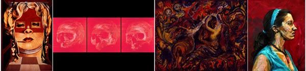
One: The Medium
All of the images are most easily recognizable as paintings. Though varying from oil and acrylic to body paint, every image portrays the sense of a painting hanging in a gallery, some of which the paint strokes are intentionally visible to the viewer.
Two: The overall color and tonal range.
All of the images are generally darker in tone and have large amounts of red, black and beige/white, which tend to create a more intense feeling about the images. In fact the third image, “Othello: My Warrior,” the color choices, as well as the strokes, are selected to induce feelings of rage, aggression and violence, which red, black and skin tones express rather well.
Three: Human Existence
There is a human element or even a sense of existentialism in each image. The image on the far left, “Mae West” by Dali, questions the human element in a non living condition, in this case we see her face in the form of an furnished apartment building. The second image is a self-portrait that is in the form of a skull, which deals with the life and death of the artist whilst they are still alive, bringing up questions of what existence is in terms of death. The third image deals with the emotional nature of humans, in this case rage, aggression and violence, depicted through the colors and fragmented figures. Lastly the fourth image deals with the deception of reality and existence of a photo or painting of a person. This image is actually a living person that has been painted to emulate a portrait and then photographed in this traditional portrait style, which distorts the lines between real life existence, photography and painting.
Four: Time
I wanted to try and put a relevant order in terms of time into my classification. All of the images pertain or were created within the last 100 years, more specifically in 25-year intervals. The first one is from 1935, the second 1960, third 1985, and the fourth 2010. The images span 75 years, bringing up a scale of images, some famous and others not, from the past to the present day.
- Attachments
-