2.28 Correlation Data | FP Tree Algorithm
2.28 Correlation Data | FP Tree Algorithm
Post here your correlation data project or FP Tree Algorithm project
George Legrady
legrady@mat.ucsb.edu
legrady@mat.ucsb.edu
Re: 2.28 Correlation Data | FP Tree Algorithm
RJ Duran
MAT259 Winter 2012
Data Visualization
Project 3
Introduction
The goal of this project is to correlate two sets of data and visualize their relationship. The question is “How do last.fm album plays compare to SPL CD checkouts for popular music in 2011?”
In the visualization there are two colors used to represent the percentage of listens on last.fm vs number of checkouts from the Seattle Public Library in 2011. As you hover over each album the colors become visible.
Queries
SPL QUERY
LAST.FM QUERIES
album.search
album.getinfo
Explanation
SPL QUERY
This query pulls the data for title and total number of checkouts in 2011 for accd itemtypes with a subject like popular and music. The data is then grouped by title and ordered from most to least number of checkouts.
LAST.FM QUERIES
There are two queries used to request the information from last.fm, album.search and album.getinfo. album.search accepts an album title and returns the top results. In this case it’s requesting fame+monster. It’s using an api key and requesting a return data format of json. Once the album is found we know the artist and the correct album title. album.getinfo is used to get additional information like the playcount and artwork url for the album.
Query Request Time
The SPL QUERY doesn’t take more than a few seconds at most but the LAST.FM QUERIES are incredibly slow when doing a search and pulling a lot of data. I decided to save both data sets in text files to reduce the data load time. When the program loads, the data loads immediately. The image files used to display the album artwork still needs to load so this takes a few seconds.
Analysis
I tried to communicate the difference between last.fm album plays and SPL checkouts and ran into a few issues. The biggest issue is that the actual data shows that last.fm is by far the most used method for listening to music. Because of this, the scale for last.fm is between hundreds and millions of plays per album vs zero to a little over one thousand for SPL checkouts. I had to normalize the data and represent it as a percentage to illustrate the difference between the two.
Another big issue has to do with the naming convention for library data. There are anomalies in the title’s used and no artist names are ever used. This means that when the data is passed into last.fm, it has to work hard to auto correct and search for albums.
The correlation between the two data sets also presented a challenge in accurately finding the correct album from last.fm. You will notice that some of the albums have no artwork or stats for playcount. This is because last.fm couldn't find the album in it's records. They rely on outside ID3 tagging for their data.
Sketch
Result
http://rjduran.net/MAT/259/project3/SPL ... l-0078.png (Permanent)
http://rjduran.net/MAT/259/project3/SPL ... l-0063.png (Permanent)
Code http://rjduran.net/MAT/259/project3/SPL ... _Final.zip (Permanent)
http://rjduran.net/MAT/259/project3/saveQueryAsText.zip (Permanent)
http://rjduran.net/MAT/259/project3/sav ... AsText.zip (Permanent)
MAT259 Winter 2012
Data Visualization
Project 3
Introduction
The goal of this project is to correlate two sets of data and visualize their relationship. The question is “How do last.fm album plays compare to SPL CD checkouts for popular music in 2011?”
In the visualization there are two colors used to represent the percentage of listens on last.fm vs number of checkouts from the Seattle Public Library in 2011. As you hover over each album the colors become visible.
Queries
SPL QUERY
Code: Select all
select title, count(*), subj from inraw where year(cout) = '2011' AND itemtype = 'accd' AND (subj like '%popular%' and subj like '%music%') group by title order by count(*) DESC;album.search
Code: Select all
http://ws.audioscrobbler.com/2.0/?method=album.search&album=fame+monster&api_key=d023a190a026febbe19f38ba8ab53c58&format=json
Code: Select all
http://ws.audioscrobbler.com/2.0/?method=album.getinfo&api_key=d023a190a026febbe19f38ba8ab53c58&artist=Lady+Gaga&album=The+Fame+Monster&format=jsonSPL QUERY
This query pulls the data for title and total number of checkouts in 2011 for accd itemtypes with a subject like popular and music. The data is then grouped by title and ordered from most to least number of checkouts.
LAST.FM QUERIES
There are two queries used to request the information from last.fm, album.search and album.getinfo. album.search accepts an album title and returns the top results. In this case it’s requesting fame+monster. It’s using an api key and requesting a return data format of json. Once the album is found we know the artist and the correct album title. album.getinfo is used to get additional information like the playcount and artwork url for the album.
Query Request Time
The SPL QUERY doesn’t take more than a few seconds at most but the LAST.FM QUERIES are incredibly slow when doing a search and pulling a lot of data. I decided to save both data sets in text files to reduce the data load time. When the program loads, the data loads immediately. The image files used to display the album artwork still needs to load so this takes a few seconds.
Analysis
I tried to communicate the difference between last.fm album plays and SPL checkouts and ran into a few issues. The biggest issue is that the actual data shows that last.fm is by far the most used method for listening to music. Because of this, the scale for last.fm is between hundreds and millions of plays per album vs zero to a little over one thousand for SPL checkouts. I had to normalize the data and represent it as a percentage to illustrate the difference between the two.
Another big issue has to do with the naming convention for library data. There are anomalies in the title’s used and no artist names are ever used. This means that when the data is passed into last.fm, it has to work hard to auto correct and search for albums.
The correlation between the two data sets also presented a challenge in accurately finding the correct album from last.fm. You will notice that some of the albums have no artwork or stats for playcount. This is because last.fm couldn't find the album in it's records. They rely on outside ID3 tagging for their data.
Sketch
http://rjduran.net/MAT/259/project3/SPL ... l-0063.png (Permanent)
Code http://rjduran.net/MAT/259/project3/SPL ... _Final.zip (Permanent)
http://rjduran.net/MAT/259/project3/saveQueryAsText.zip (Permanent)
http://rjduran.net/MAT/259/project3/sav ... AsText.zip (Permanent)
-
anisbharon
- Posts: 10
- Joined: Tue Jan 17, 2012 4:41 pm
Re: 2.28 Correlation Data | FP Tree Algorithm
Circles on the world map are approximately mapped based on Latitude and Longitude data of the images.
Rollover (circles on world map) reveals date and time taken of the image (YYYY-MM-SS HH:MM:SS) and rollovers on chart reveals number of images taken / number of items checked out in a given month.
Re: 2.28 Correlation Data | FP Tree Algorithm
Ankit Srivastava
MAT259 Winter 2012
Project 3
Introduction
The objective behind this project was to correlate two different sets of data and find simmilarities pattern in both. I choose to correlate the checkout patterns of people watching "Movie Series'" like Pirates of the carribean, Harry Potter with data that contains performance of new parts of these movies in the year 2011.
In the visualization, I used a Treemap to represent top 10 grossing movies of 2011 and a traditional bar graph to represent the checkouts of those movie series in SPL for the year 2011.
Queries - SPL
Movies Data Set
This data set contains complete information about top 100 movies of 2011 ranging from information like budget, total gross amount, rotten tomatoes rating, etc.
I have used the Treemap to visually represent top 10 grossing Movie Series Parts in 2011. The color saturation and the area of the rectangle together indicate the ranking. The darker the saturation, and the more the area of the rectangle, the more it is in terms of overall gross amount overall.
Analysis
I tried to analyse the patterns in checkouts for CDs and DVDs for Movie Series matching the top 10 grossing Movie Series according to the dataset. It was interesting to find various kind of patterns like - in case of Pirates of the Carribean - On stranger tides, the checkout reached its peak in the month just after its release and gradually decreased. The checkouts for "X-Men: First Class" kept increasing throughout the year showing and decreased one month after the release of the new part. This shows the popularity of the previous parts in the series. Interesting patterns were seen in "Rise of Planet of the Apes" which suggested people checking out movies of this series before the release of the new part showing interest in catching up with the previous parts since the last part was released in 2001, more than 10 years ago, In constrast with others where previous parts were relatively recent. Not much can be said about "Twilight - Breaking Dawn" since the checkouts kept increasing towards the first half of the year but decreased towards the release of the movie. It would be interesting to map these findings on a larger timeline, that could catch checkout patterns for more parts of these series and see how these movies fare against each other and correlate with their total gross rankings.
Sample Screenshots
Project Code
SPL Query Code
MAT259 Winter 2012
Project 3
Introduction
The objective behind this project was to correlate two different sets of data and find simmilarities pattern in both. I choose to correlate the checkout patterns of people watching "Movie Series'" like Pirates of the carribean, Harry Potter with data that contains performance of new parts of these movies in the year 2011.
In the visualization, I used a Treemap to represent top 10 grossing movies of 2011 and a traditional bar graph to represent the checkouts of those movie series in SPL for the year 2011.
Queries - SPL
Code: Select all
select month(cout), count(*) from spl0.inraw where year(cout) = 2011 and title like '%Harry Potter% group by month(cout)
This data set contains complete information about top 100 movies of 2011 ranging from information like budget, total gross amount, rotten tomatoes rating, etc.
I have used the Treemap to visually represent top 10 grossing Movie Series Parts in 2011. The color saturation and the area of the rectangle together indicate the ranking. The darker the saturation, and the more the area of the rectangle, the more it is in terms of overall gross amount overall.
Analysis
I tried to analyse the patterns in checkouts for CDs and DVDs for Movie Series matching the top 10 grossing Movie Series according to the dataset. It was interesting to find various kind of patterns like - in case of Pirates of the Carribean - On stranger tides, the checkout reached its peak in the month just after its release and gradually decreased. The checkouts for "X-Men: First Class" kept increasing throughout the year showing and decreased one month after the release of the new part. This shows the popularity of the previous parts in the series. Interesting patterns were seen in "Rise of Planet of the Apes" which suggested people checking out movies of this series before the release of the new part showing interest in catching up with the previous parts since the last part was released in 2001, more than 10 years ago, In constrast with others where previous parts were relatively recent. Not much can be said about "Twilight - Breaking Dawn" since the checkouts kept increasing towards the first half of the year but decreased towards the release of the movie. It would be interesting to map these findings on a larger timeline, that could catch checkout patterns for more parts of these series and see how these movies fare against each other and correlate with their total gross rankings.
Sample Screenshots
-
dallasmercer
- Posts: 7
- Joined: Tue Jan 17, 2012 4:43 pm
Re: 2.28 Correlation Data | FP Tree Algorithm
Here is my Correlation Project relating the subject matter of Obama between the SPL and NY Times API database. I found a strong correlation between the 2 sets of data and find it very interesting since the data is from the NW corner of the United States (Seattle) and the NE corner (New York).
The interactivity happens as the mouse scrolls from left to right. The SPL data is represented by the red lines and the NY Times by the white. While the mouse is at the furthest left point, the SPL data is most prevalent and the red lines stand out beyond the white. The furthest right is the same for the white lines (NY Times) and the middle yields the 2 colors to be equal, representing the strong correlation at its best.
The interactivity happens as the mouse scrolls from left to right. The SPL data is represented by the red lines and the NY Times by the white. While the mouse is at the furthest left point, the SPL data is most prevalent and the red lines stand out beyond the white. The furthest right is the same for the white lines (NY Times) and the middle yields the 2 colors to be equal, representing the strong correlation at its best.
- Attachments
-
- Obama_1.zip
- Full project files including query text and all .pde information
- (84.61 KiB) Downloaded 398 times
-
- Center mouse position with equal data colors shown
-
- Right-most NY Times data shown
-
- Left-most SPL data shown
-
hanyoonjung
- Posts: 9
- Joined: Tue Jan 17, 2012 4:40 pm
Re: 2.28 Correlation Data | FP Tree Algorithm
MAT 259 Data Visulization Winter 2012
Project 3. Correlation Data
by Yoon Chung Han
Concept:
My goal of this project was to investigate how many items related to North Korea and South Korea were checked out from 2005 to 2011. And I was also interested in different results between NYTimes and Seattle Public Library since NYTimes is based on newspaper and online articles, and Seattle Public Library contains many different kinds of mediums and contents. I was curious how much items people checked out, and how it would be related to each other over years. In this data visualization, I mostly focused on color contrast: Red as North Korea and Blue as South Korea. The two color represent the national colors in national flags, and it directly shows the two countries' different identities. Through this research, I was surprised that there were quite many items checked out over years, and NYTimes and SPL showed different peak times.
Implementation:
First, I searched the checked out data by using this query.
select year(cout), month(cout), count(*) from inraw where cout > '2005-01-01' and title like '%North Korea%' group by year(cout), month(cout) order by year(cout), month(cout);
Over years and months, I achieved the different numbers, and I visualized the numbers by heights of bars. And as a representation of "Taeguk" in Korea's national flag, I arranged the two bars inversely; Red bars(North Korea) were arranged upward, and Blue bars(South Korea) were arranged downward.
First draft images
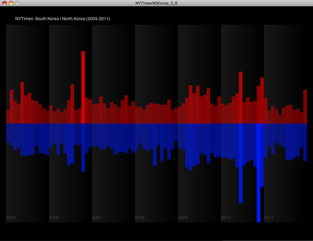
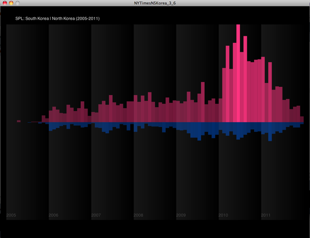
In the first design, I used keyboard event to change two pages. First page shows NYTimes and Second page shows SPL data.
However, in order to compare those two results, I should fix the interaction and way of showing two results. So, I changed to use mouse movement as a way of changing two pages. If you move your mouse from left to right, you can see the result from NYTimes to SPL. Now, it's easy to compare those two datas and results. Total numbers of checked out items are also appeared right above each bar, so it's easy to get the details of the data results.
Final design images
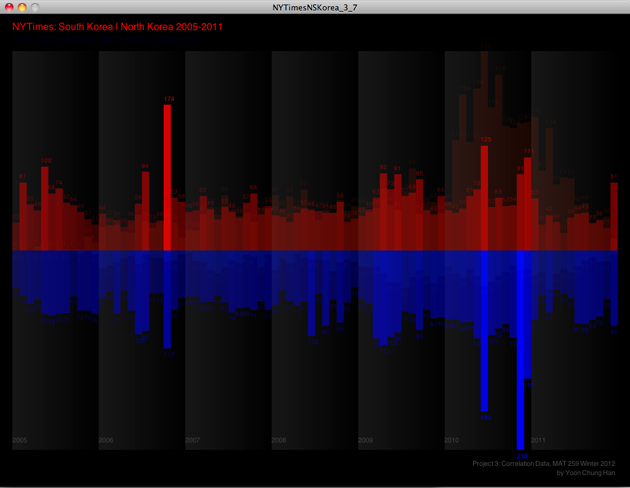
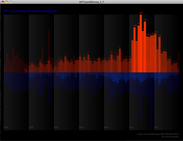
Processing Codes:
1. First draft code: http://www.yoonchunghan.com/MAT259/Proj ... ea_3_6.zip
2. Final code: http://www.yoonchunghan.com/MAT259/Proj ... ea_3_7.zip
Project 3. Correlation Data
by Yoon Chung Han
Concept:
My goal of this project was to investigate how many items related to North Korea and South Korea were checked out from 2005 to 2011. And I was also interested in different results between NYTimes and Seattle Public Library since NYTimes is based on newspaper and online articles, and Seattle Public Library contains many different kinds of mediums and contents. I was curious how much items people checked out, and how it would be related to each other over years. In this data visualization, I mostly focused on color contrast: Red as North Korea and Blue as South Korea. The two color represent the national colors in national flags, and it directly shows the two countries' different identities. Through this research, I was surprised that there were quite many items checked out over years, and NYTimes and SPL showed different peak times.
Implementation:
First, I searched the checked out data by using this query.
select year(cout), month(cout), count(*) from inraw where cout > '2005-01-01' and title like '%North Korea%' group by year(cout), month(cout) order by year(cout), month(cout);
Over years and months, I achieved the different numbers, and I visualized the numbers by heights of bars. And as a representation of "Taeguk" in Korea's national flag, I arranged the two bars inversely; Red bars(North Korea) were arranged upward, and Blue bars(South Korea) were arranged downward.
First draft images
In the first design, I used keyboard event to change two pages. First page shows NYTimes and Second page shows SPL data.
However, in order to compare those two results, I should fix the interaction and way of showing two results. So, I changed to use mouse movement as a way of changing two pages. If you move your mouse from left to right, you can see the result from NYTimes to SPL. Now, it's easy to compare those two datas and results. Total numbers of checked out items are also appeared right above each bar, so it's easy to get the details of the data results.
Final design images
Processing Codes:
1. First draft code: http://www.yoonchunghan.com/MAT259/Proj ... ea_3_6.zip
2. Final code: http://www.yoonchunghan.com/MAT259/Proj ... ea_3_7.zip
-
davidgordonartist
- Posts: 7
- Joined: Tue Jan 17, 2012 4:42 pm
Re: 2.28 Correlation Data | FP Tree Algorithm
I was interested whether a decreasing interest in real estate, likely due to the US mortgage collapse, coincided with a focus on Greece during the European financial crisis. I used a Library SQL query to search for the number of checkout transactions with titles containing "Real Estate:"
select year(cout), month(cout), count(*) from inraw where title like '%real estate%' and cout > '2006-01-01' and cout < '2012-01-01' and deweyClass != 'null' and year(cout) >= '2006' group by year(cout), month(cout) order by year(cout), month(cout);
I used a New York Times API query to search for the number of articles each month containing "Greece."
Each month appears as a circle on the graph, with larger circles representing higher count. The SPL transactions appear as black circles, whereas NYT articles appear as white circles with black dots representing the front page articles for that month. Using the mouse, the user can display that month's of the first NYT front page article title.
- Attachments
-
- gordon_correlation.zip
- (137.9 KiB) Downloaded 416 times