Under the broad spectrum of the ‘human visual system,’ Gabriele Peters has detailed six dimensions of visual aesthetics: color, form, special organization, motion, depth and the human body. Combined, these categories form what Peters calls ‘the aesthetic principles.’ These not only define what we see around us, but also become tools from which we can understand imagery.
Firstly, color is interpreted best with the statement ‘less is more.’ For instance, an image with too many strong colors becomes overbearing and the aesthetically pleasing quality about it is lost. Yet, if there are only a few strong colors, these colors become the foreground of what is interpreted and the rest of the colors become subordinate. More so, the colors within an image are more striking when they are complimentary and the focal points of the image:

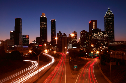
This photograph serves to illustrate the beautiful effect of complimentary colors as main focal points; both the orange and blue reinforce themselves mutually in what Peter’s calls ‘their luminance.’
Also, images must take into consideration their ‘dynamic range,’ or their ratio of luminance values from the brightest highlights to the darkest shadows. We can see this demonstrated in the photograph below through its full tonal range.
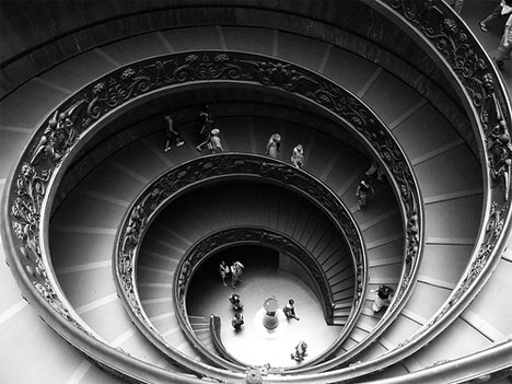
Hence, there is a distinguishable difference between the crisp whites, dark blacks and the range of middle-tone grey values.
Next, form provides us with not only a sense of navigation and space, but also a source of aesthetic sensation. The clarity of form is present in the lines and surfaces (of even contrast gradient and color changes) of the image. As a rule of thumb, an image should contain few shapes, which overall are ‘consistent, simple, and clearly recognizable.’ This helps the eye move navigate the image and make sense of what the viewer is seeing. Yet, shapes do not always have to be ‘positive.’ Shapes formed from the negative space are called silhouettes and can appear beautifully if they capture the main characteristic of an object. Like Muybridge’s moving horse, which Peters uses as an example, the image below is a sharp-edged and clearly distinctive shape. This makes the silhouette aesthetically pleasing to the viewer.

Spatial organization is both the shapes within the image and their mutual relationship within the space they encompass. For instance, too many objects in a single image can cause confusion because of the overload on details.

Here, the central focus of the image is undistinguishable because the attention of the viewer is caught off guard by the closeness of the foreground object. Also, while in most images the upper left corner is where the viewer starts interpretation, the presence of the blurred, large foreground object hinders the viewers’ eye to move around the photograph. The viewers specific eye movement around the picture can be attributed to the ‘golden mean,’ which is a particular ratio of an asymmetrical line division (more commonly found in nature, but recreated in photography.)
Texture, rhythm, repetition and variation also play a role in how an image should be composed. Texture, or the characteristics of a surface, can be seen through pattern or what Peters calls a clustering allusion, which is a phenomena in which the viewer connects an organizing principle even in arbitrary structures such as clouds. Rhythm, repetition and variation are created in an image through the use of regularly, or in the case of variation, irregularly distanced shapes or objects.
Repetition is the repeating of common variables, while variation is the subtle differences in the repetition pattern. For example, the image below illustrates nineteen bucket-like forms. While the forms repeat in their general visual aesthetic, the differing nicks and angles to the figures illustrate slight variations within the repetitive shape.

Also, visual rhythm is described by how the viewer’s eye is drawn across an image. There are several differing types of rhythm: regular rhythms (ab ab…) are most common, alternating rhythms (aba cdc aba efe aba) and progressive rhythms (ab aabb aaabbb).
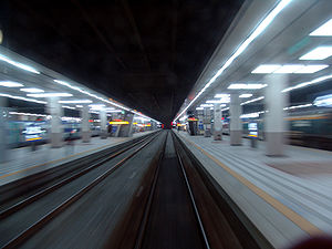
Next, motion refers to life and action. According to Alexander Calder, motion is most effective by placing highly contrasting surfaces side by side. This is demonstrated in today’s images through the use of the blur and the distinct motion phases. The blur, or un-sharpness in one direction, indicated that an object is moving by the high contrasts within the image. For example, this image below demonstrates high contrast changed in the blurred areas (and thus, says to the viewer that this object is moving.)
Distinct motion phases are the depiction of a number of distinct motions within a single image. Straight forwardly, the image blow illustrates the movement of a dancer:

More so, depth refers to how images articulate a 3-D world onto a 2-D plane. This can be done numerous ways, including overlapping objects, controlling variation in size or controlling variation in height. Objects that are ‘closer’ are bigger and lower and objects that are farther away are smaller and higher in the composition. Linear perspective, which dates to the early 1400’s, expands upon these details by placing objects on two parallel lines that converge on the horizon line. The farthest point ‘in the distance’ then is called the ‘vanishing point.’

Sharpness and un-sharpness also contribute. For example, the contrasting sharp versus un-sharp areas of this image (below) directs our focus to the main element within the composition, her face.

Lastly, the human body is a special tool in which to interpret visual information and, more importantly, a object’ to be studied by itself. Principle axes, for example, are used to examine the human body. Principle axes are axes of symmetry, which constitute an objects global form. In other words, if a human body is skewed or contorted around this particular axis, the viewer will still be able to identify what they are looking as a human. This is considered by many to be an aesthetic pleasing because we can denote the human body as a shape in itself. Hence, the human body is recognizable to use, and thus comfortable for us to see.


 This projection was most often used for nautical travel because while the landmass scale is not accurate, the cardinal direction is. The Allosphere globe has no projection issues, since it is a globe, making viewing, measuring and studying of the surface much for accurate.