Two perpendicular red lines appear to be scanning a grid repeatedly subdivided into smaller, equal-sized modules (see image below), this precise and "functional" appearing frame from Ryoji Ikeda's
data.tronresembles a graph and perhaps evokes a machine that accurately plots or observes something that is then graphed onto this frame. But *what* is one reading when looking at this image still? This implied functionality and information overload is my topic for this week.
(This is very rambling-like and I will only talk about Eames's Sample Lesson in class for clarity and saving time.)
 Representing "the economy"
. Chad framed Ikeda's work as embodiment of Kant's mathematical sublime. Due to the sheer scale and impressiveness of the installation, the visitor can be overwhelmed. This overwhelm in
data.tron came from both the content (flickering field of signs and stripes), as well as the format -- it was presented at 4 times the frame rate of typical film.
. Also using Ikeda's work as an example of "technical sublime", Nick Srnicek gave a two-part model of representing a complex concept such as "the economy" -- the combination of aesthetics of the sublime, which emerges from "the effective use of mathematical and technological tools to extend cognition
beyond the sensible parameters of the human" but that "render complex systems in a way which encompasses them but with a
negligible reduction of information" (e.g. Ikeda), and aesthetics of the interface, which "
modulates the relationship between the technological representation of the complex economic object and the human cognitive system" (Srnicek 2012). It's refreshing to see Ikeda's work being framed as something useful -- Srnicek believed that art (by doing those two parts) could help one represent the object "economy", which then allows one to come up with alternatives to neoliberalism.
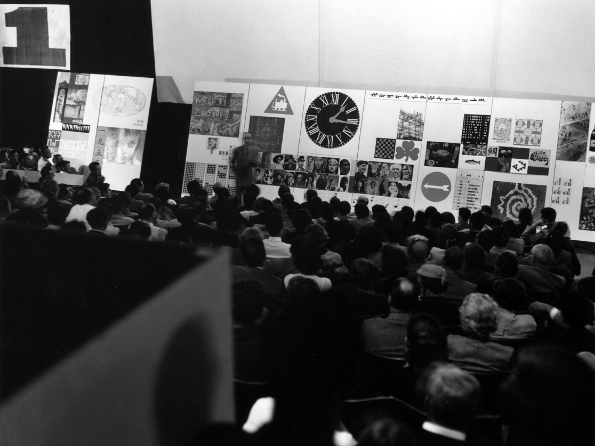
Precedent: George Nelson, Charles Eames, and Alexander Girard, Sample Lesson (1952)
. Appropriate for its subject, "communications", the Sample Lesson by modernist architect Charles Eames was described by a journalist in 1952 as "information overload", an ubiquitous phrase today. The designers wanted the viewer to see "
connections" among the fast moving footages on a motion picture projection and multiple panels of lecture slides, as well as to evoke an emotional response (Colomina, "The Design of Information Overload"). Made in the immediate post-war years and after the publication of Shannon's thesis (a diagram of which was included in the film), the format of the delivering knowledge resembles situation rooms or control rooms used in a military context. If the situation room screens are functional, one is supposed to be able to observe and understand the contents on the screen, which is an impossible task in artworks that are visually similar to the situation room, such as Eames's Sample Lesson as well as Ikeda's installation.
. George Nelson, Charles Eames, and Alexander Girard,
Sample Lesson , 1952.
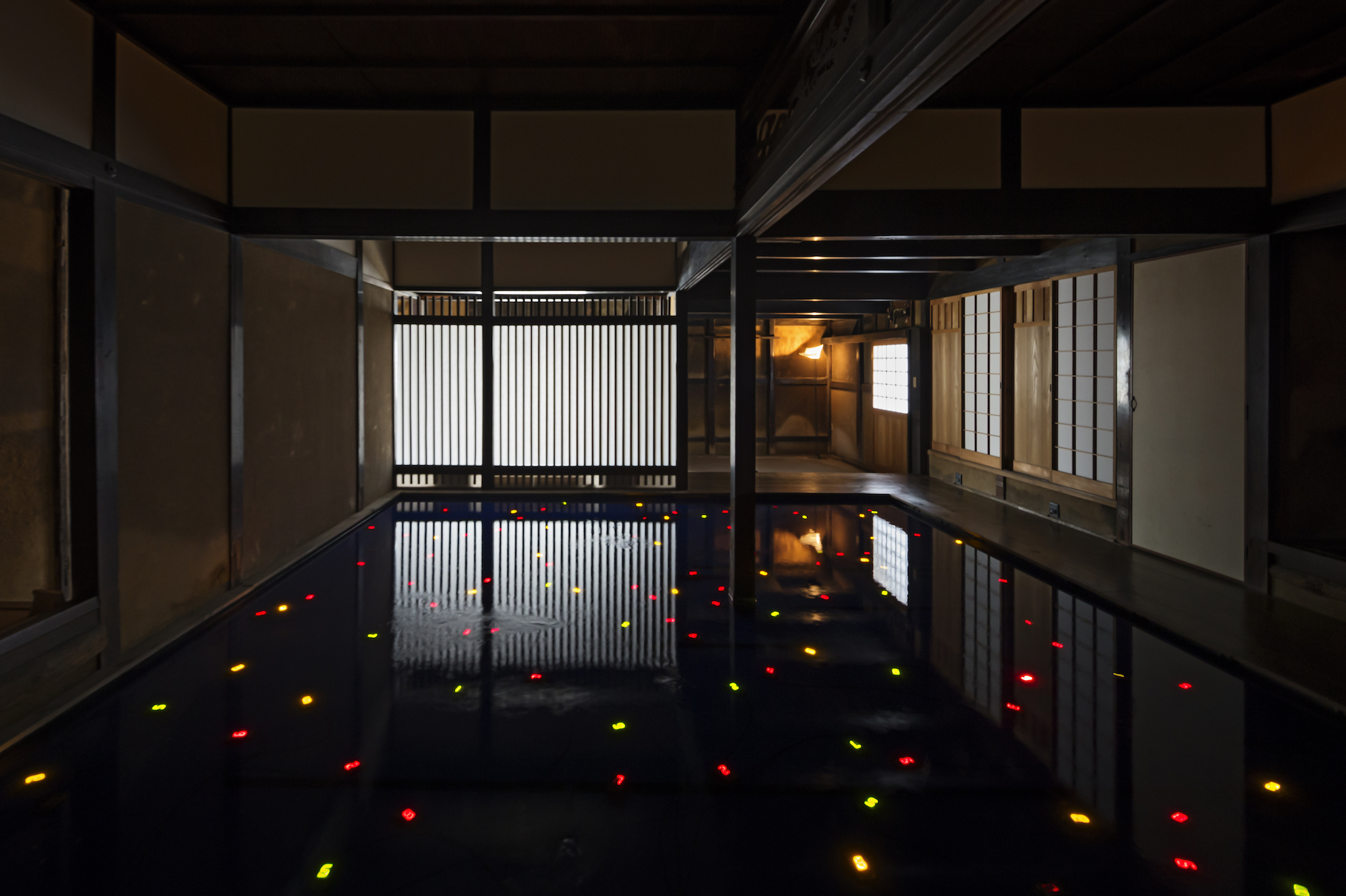
. Looking at the 3k version of
data.tron (see image below), one could recognize multiple "graphs" within the projection, yet the size of the long strip as well as our limited field of vision and attention span makes the graphs unreadable.
 Conclusion?
To wrap up, what I learnt is that:
- The format of "information overload" as well as using a supposedly readable interface or graph in an unreadable speed or scale could find its historical precedent in early Cold War works such as Sample Lesson (Charles and Ray Eames later made other similar works such as Glimpses of the USA and Think).
- - This format, as described by both Eames and later Ikeda, are intended to evoke an emotional response.
- - This emotional response to information overload perhaps tells us that the situations that are monitored in situation rooms (which may have inspired the Eameses) may be in fact uncontrollable and overwhelming. In a way, art of information overload can be seen as counter-examples to the clarity and control in data visualization dashboards (e.g. covid spread maps, etc.).
- - Through presentation of information on disparate panels, Eames also intended to have the viewer see
connections. I understand this "connection" as the viewer's sorting through noise to arrive at information.
- Combining the intention to have the user see "connection" as well as Srnicek's idea to expand one's cognitive mapping with mathematical and computational tools, and the idea of conspiracy theory as "poor person's cognitive mapping"(Jameson) or an legitimate form of cognitive mapping (Fran Mason), one could possibly try to understand art about conspiracy through the lens of signal and noise, and to compare them to works by Ikeda and the Eameses.
Beatriz Colomina. "The Design of Information Overload." Accessed 3 Nov. 2020,
www.bauhaus-imaginista.org/articles/592 ... fcbf1c976e.
Nick Srnicek. "Navigating Neoliberalism: Political Aesthetics In the Age of Crisis" (2012),
https://www.fkawdw.nl/files/Navigating_ ... _Aesth.pdf