wk4 10.14/10.16: Data, Information Arts, Information, Noise
For this assignment, first read my article from the Bloomsbury Encyclopedia of New Media Art: "Big Data: From Data to Metadata" https://www.mat.ucsb.edu/~g.legrady/aca ... igdata.pdf
Afterwards, review the artworks, articles and links at the course website for wk4 at https://www.mat.ucsb.edu/~g.legrady/aca ... f200a.html and select three items posted here and write a brief essay that somehow makes connections between your chosen topics.
wk4 10.14/10.16: Data, Information Arts, Information, Noise
-
jintongyang
- Posts: 10
- Joined: Wed Oct 01, 2025 2:38 pm
Re: wk4 10.14/10.16: Data, Information Arts, Information, Noise
From the I Ching diagrams that inspired Gottfried Wilhelm Leibniz’s binary system in 1701, to the public installation eCLOUD (2010) by Aaron Koblin, Nik Hafermaas, and Dan Goods, and the audiovisual installation data.tron (2011) by Ryoji Ikeda, I see an evolution in how we understand and aestheticize duality. Across ancient philosophy, architecture, computation, and audiovisual art, these works share a logic built upon two simple states: on/off, presence/absence, black/white…Yet from this simplicity, they generate intricate systems of thought and perception.
As an ancient Chinese philosophical text, the I Ching was created to reveal and predict the transformations of nature. I once studied it out of curiosity, and was deeply impressed by its internal elegance. There is a saying in Taoism: “The Tao produces one; one produces two; two produces three; three produces all things” The simplest symbols, yin yao (“--”) and yang yao (“—”), can combine in eight different ways to form the Ba Gua, or eight trigrams (2³ = 8). These trigrams then pair and evolve into sixty-four hexagrams (8² = 64), a complete cosmology of time, change, and existence. Each hexagram represents a state of the world, a relational pattern within the continuous flow of transformation. To me, this structure feels like an ancient form of data architecture. It shows how simple information can unfold into complexity, how minimal relationships record patterns, memory, and even traces of human life.
When Leibniz encountered the I Ching in 1701 (Fig.1), the philosophical currents of East and West briefly intersected. The alternating yin and yang lines in the I Ching mirrored his belief that the universe could emerge from the tension between nothing (0) and something (1). What had once been a cosmological intuition in ancient China was reinterpreted in Europe as a mathematical principle: a logic of being that could be written, calculated, and eventually programmed. It’s striking to realize that this early encounter between philosophy and mathematics anticipated the foundations of modern computation.

Fig.1. Gottfried Wilhelm Leibniz, I Ching and hexagrams, 1701.
I see this same wisdom applied in an opposite way in eCLOUD (2010) (Fig.2), which transforms binary philosophy into a spatial and real-time experience. Suspended across an airport terminal, hundreds of transparent acrylic panels shift continuously between clear and frosted states according to real-time FAA weather data. Transparency and opaque become zero and one. The artists translate Big Data into a simple yet poetic visualization: data becomes air, light, and rhythm, a living atmosphere that breathes with information. The work turns digital logic into something you can actually feel: what once existed as code becomes a climate of perception. Beneath the moving panels, travelers sense time and distance through subtle variations in brightness and texture. It merges so seamlessly with the behavior of people passing through the airport that space itself becomes an interface between data and consciousness.

Fig.2. Aaron Koblin, Nik Hafermaas, and Dan Goods, eCLOUD, 2010.
Ryoji Ikeda’s data.tron (2011) (Fig.3) brings this sense of duality directly into the human body. In a darkened room, endless fields of white numbers flicker against a black void, perfectly synchronized with sharp, high-frequency sound. The work uses a kind of noise to reveal how we experience data and how noise itself can become data, just as chaos once became the world and the human mind turns complexity into logic. In Ikeda’s universe, data is not a representation of reality but a state of being: pure vibration, the smallest perceptual unit of time. The binary becomes physical. It moves through the body like a pulse, something you feel more than understand. Ikeda turns the invisible structure of information into something tangible and strangely emotional, making the cold logic of the digital world suddenly feel alive.

Fig.3. Ryoji Ikeda, data.tron, 2011.
The binary doesn’t feel like a limitation to me, but more like an endless field of possibilities and a quiet system that helps us make sense of space, time, and existence. I believe this system has always shaped our technological breakthroughs, cognitive processes, and artistic practices.
As an ancient Chinese philosophical text, the I Ching was created to reveal and predict the transformations of nature. I once studied it out of curiosity, and was deeply impressed by its internal elegance. There is a saying in Taoism: “The Tao produces one; one produces two; two produces three; three produces all things” The simplest symbols, yin yao (“--”) and yang yao (“—”), can combine in eight different ways to form the Ba Gua, or eight trigrams (2³ = 8). These trigrams then pair and evolve into sixty-four hexagrams (8² = 64), a complete cosmology of time, change, and existence. Each hexagram represents a state of the world, a relational pattern within the continuous flow of transformation. To me, this structure feels like an ancient form of data architecture. It shows how simple information can unfold into complexity, how minimal relationships record patterns, memory, and even traces of human life.
When Leibniz encountered the I Ching in 1701 (Fig.1), the philosophical currents of East and West briefly intersected. The alternating yin and yang lines in the I Ching mirrored his belief that the universe could emerge from the tension between nothing (0) and something (1). What had once been a cosmological intuition in ancient China was reinterpreted in Europe as a mathematical principle: a logic of being that could be written, calculated, and eventually programmed. It’s striking to realize that this early encounter between philosophy and mathematics anticipated the foundations of modern computation.
Fig.1. Gottfried Wilhelm Leibniz, I Ching and hexagrams, 1701.
I see this same wisdom applied in an opposite way in eCLOUD (2010) (Fig.2), which transforms binary philosophy into a spatial and real-time experience. Suspended across an airport terminal, hundreds of transparent acrylic panels shift continuously between clear and frosted states according to real-time FAA weather data. Transparency and opaque become zero and one. The artists translate Big Data into a simple yet poetic visualization: data becomes air, light, and rhythm, a living atmosphere that breathes with information. The work turns digital logic into something you can actually feel: what once existed as code becomes a climate of perception. Beneath the moving panels, travelers sense time and distance through subtle variations in brightness and texture. It merges so seamlessly with the behavior of people passing through the airport that space itself becomes an interface between data and consciousness.
Fig.2. Aaron Koblin, Nik Hafermaas, and Dan Goods, eCLOUD, 2010.
Ryoji Ikeda’s data.tron (2011) (Fig.3) brings this sense of duality directly into the human body. In a darkened room, endless fields of white numbers flicker against a black void, perfectly synchronized with sharp, high-frequency sound. The work uses a kind of noise to reveal how we experience data and how noise itself can become data, just as chaos once became the world and the human mind turns complexity into logic. In Ikeda’s universe, data is not a representation of reality but a state of being: pure vibration, the smallest perceptual unit of time. The binary becomes physical. It moves through the body like a pulse, something you feel more than understand. Ikeda turns the invisible structure of information into something tangible and strangely emotional, making the cold logic of the digital world suddenly feel alive.
Fig.3. Ryoji Ikeda, data.tron, 2011.
The binary doesn’t feel like a limitation to me, but more like an endless field of possibilities and a quiet system that helps us make sense of space, time, and existence. I believe this system has always shaped our technological breakthroughs, cognitive processes, and artistic practices.
Last edited by jintongyang on Sun Oct 26, 2025 9:07 pm, edited 2 times in total.
Re: wk4 10.14/10.16: Data, Information Arts, Information, Noise
I decided to work with data that holds personal meaning for me. Throughout my work, I have been interested in the impacts of production and consumption systems on both the environment and society. To discuss how we can move forward in terms of reducing waste or preventing environmental degradation, data analysis becomes a key step. Within these topics, social issues are equally important because they are deeply interconnected with environmental concerns. From this perspective, I chose to focus on Wind Map, Million Dollar Blocks, and the works of Ryoji Ikeda.
Based on the reading, I see the importance of data as a new material for artists. Beyond its functional use, data serves as a raw material for aesthetic exploration and artistic production. This was one of the most powerful ideas from the article. Through data, artists can create new interpretations of measurement, pattern, and representation.
The projects I selected exemplify this. Million Dollar Blocks uses data to visualize social inequality by mapping where people sent to prison come from. The analysis revealed that a few city blocks account for a disproportionately high percentage of incarceration. The team went further by calculating the financial costs of imprisonment for these areas, showing that tens or even hundreds of millions of dollars could instead be invested in community development to change these patterns.
In Wind Map, artists created an interactive visualization that displays real-time wind patterns across the U.S. Using surface wind data and dynamic visual trails, the artwork reveals both the flow and speed of the wind. What I find compelling is how the natural phenomena become visible through an artistic lens — we can see the invisible. The movement of air transforms into a poetic visualization that reminds us of our connection to larger natural forces.

The reflections and emotions evoked by these works are inseparable from their mediums of presentation. The social cost of incarceration or the shifting wind patterns are not only data points — they become powerful through their artistic representation. We reflect on them because we are moved by the visualization. Aesthetics and message coexist, dancing together in a meaningful way.
As the article states, “Data today cannot be understood apart from its delivery systems.” What I take from these examples is that understanding the digital environment — including sensors, networks, and visualization tools — is essential for artists who work with data. This analysis made me realize that mastering the technologies behind the data is part of the creative process itself.
Finally, I want to highlight the work of Ryoji Ikeda. First, his ability to work with data from diverse and complex domains — such as astronomical information, particle collisions, or crystal structures — and transform it into immersive sensory experiences is remarkable. As Ikeda himself says, “All of my work is open. You don’t need special tools to understand it; you charge it with meaning all by yourself.”
Second, he transforms data — often seen as purely logical or mathematical — into aesthetic experiences that engage emotion and perception. And third, his capacity to “sculpt space-time” through sound and visuals shows how he orchestrates multiple fields into live performances and installations.
His work deeply connects with the article “Big Data: From Data to Metadata” in two ways. First, the cross-disciplinary discovery where he combine datasets from multiple domains enables both scientific insight and aesthetic exploration. And second, the Internet as a creative substrate where Big Data’s inseparability from the Internet makes it not only a technical infrastructure but also a cultural and artistic platform.

Based on the reading, I see the importance of data as a new material for artists. Beyond its functional use, data serves as a raw material for aesthetic exploration and artistic production. This was one of the most powerful ideas from the article. Through data, artists can create new interpretations of measurement, pattern, and representation.
The projects I selected exemplify this. Million Dollar Blocks uses data to visualize social inequality by mapping where people sent to prison come from. The analysis revealed that a few city blocks account for a disproportionately high percentage of incarceration. The team went further by calculating the financial costs of imprisonment for these areas, showing that tens or even hundreds of millions of dollars could instead be invested in community development to change these patterns.
In Wind Map, artists created an interactive visualization that displays real-time wind patterns across the U.S. Using surface wind data and dynamic visual trails, the artwork reveals both the flow and speed of the wind. What I find compelling is how the natural phenomena become visible through an artistic lens — we can see the invisible. The movement of air transforms into a poetic visualization that reminds us of our connection to larger natural forces.
The reflections and emotions evoked by these works are inseparable from their mediums of presentation. The social cost of incarceration or the shifting wind patterns are not only data points — they become powerful through their artistic representation. We reflect on them because we are moved by the visualization. Aesthetics and message coexist, dancing together in a meaningful way.
As the article states, “Data today cannot be understood apart from its delivery systems.” What I take from these examples is that understanding the digital environment — including sensors, networks, and visualization tools — is essential for artists who work with data. This analysis made me realize that mastering the technologies behind the data is part of the creative process itself.
Finally, I want to highlight the work of Ryoji Ikeda. First, his ability to work with data from diverse and complex domains — such as astronomical information, particle collisions, or crystal structures — and transform it into immersive sensory experiences is remarkable. As Ikeda himself says, “All of my work is open. You don’t need special tools to understand it; you charge it with meaning all by yourself.”
Second, he transforms data — often seen as purely logical or mathematical — into aesthetic experiences that engage emotion and perception. And third, his capacity to “sculpt space-time” through sound and visuals shows how he orchestrates multiple fields into live performances and installations.
His work deeply connects with the article “Big Data: From Data to Metadata” in two ways. First, the cross-disciplinary discovery where he combine datasets from multiple domains enables both scientific insight and aesthetic exploration. And second, the Internet as a creative substrate where Big Data’s inseparability from the Internet makes it not only a technical infrastructure but also a cultural and artistic platform.
-
ericmrennie
- Posts: 9
- Joined: Wed Oct 01, 2025 2:33 pm
Re: wk4 10.14/10.16: Data, Information Arts, Information, Noise
Big Data, which entered public discourse in the early 2000s, “represents the ever-growing accumulation of diverse sets of information in digital form” (Legrady). Artists have embraced these vast datasets as raw material for creative exploration, visualizing information in innovative ways that comment on society, construct narratives from data, or provoke curiosity by reimagining data for unconventional and unexpected purposes. Three works that exemplify these approaches are Thousand Little Brothers by Hasan Elahi, eCLOUD by Dan Goods, and Million Dollar Blocks created by Laura Kurgan, Eric Cadora, and a team at Columbia University.
Thousand Little Brothers by Hasan Elahi is a series of 32,000 photographs taken over the course of twelve years. After a false tip led the FBI to suspect him of possible terrorist activity, Elahi began sending the agency photographs documenting every aspect of his daily life, assisting in their investigation while simultaneously mocking it. These images ranged from pictures of his meals to photos taken during bathroom visits. Through this project, Elahi explores themes of government surveillance and self-exposure, transforming the invasive act of being watched into a commentary on the vast amount of personal data we produce and share.
Thousand Little Brothers by Hasan Elahi https://www.movingwalls.org/moving-wall ... thers.html
eCloud by Dan Goods is a data-driven sculpture that responds to real-time weather data from around the world. Installed at San José Airport, the piece features polycarbonate tiles that shift between transparent and opaque states, mimicking the weather of various cities. Nearby, a monitor displays the name of the city currently represented, along with its weather data. A similar airport installation I admire, created by ESI Design, features screen displays that react to each takeoff at LaGuardia Airport. The screens, located inside one of the terminals, transform to show images of the destination to which each departing plane is headed.
eCloud by Dan Goods https://www.archdaily.com/100888/video- ... al-airport
Delta Terminal C at Laguardia Airport by ESI Design https://esi.nbbj.com/work/delta-lga-ter ... experience
Million Dollar Blocks is a data visualization project that highlights neighborhoods, referred to as “million dollar blocks," where the government spends millions of dollars to incarcerate residents. The visualization reveals how concentrated incarceration can be within specific urban areas, often showing that many individuals from the same block end up in prison, and that many return within just a few years of release. The project highlights the immense financial cost of incarceration, suggesting that these funds could instead be invested in improving communities and supporting their residents. On the maps, areas with the highest incarceration spending are represented by bright red blocks.
Million Dollar Blocks by Laura Kurgan, Eric Cadora, and others https://c4sr.columbia.edu/projects/mill ... lar-blocks
Living in the age of Big Data, artists are transforming abstract information into meaningful visual and sensory works. By reimagining how data can be seen and felt, they reveal new perspectives on information in ways we might not have considered. Through their work, artists not only make complex data accessible to the public but also inspire reflection, dialogue, and the potential for change.
Thousand Little Brothers by Hasan Elahi is a series of 32,000 photographs taken over the course of twelve years. After a false tip led the FBI to suspect him of possible terrorist activity, Elahi began sending the agency photographs documenting every aspect of his daily life, assisting in their investigation while simultaneously mocking it. These images ranged from pictures of his meals to photos taken during bathroom visits. Through this project, Elahi explores themes of government surveillance and self-exposure, transforming the invasive act of being watched into a commentary on the vast amount of personal data we produce and share.
eCloud by Dan Goods is a data-driven sculpture that responds to real-time weather data from around the world. Installed at San José Airport, the piece features polycarbonate tiles that shift between transparent and opaque states, mimicking the weather of various cities. Nearby, a monitor displays the name of the city currently represented, along with its weather data. A similar airport installation I admire, created by ESI Design, features screen displays that react to each takeoff at LaGuardia Airport. The screens, located inside one of the terminals, transform to show images of the destination to which each departing plane is headed.
eCloud by Dan Goods https://www.archdaily.com/100888/video- ... al-airport
Million Dollar Blocks is a data visualization project that highlights neighborhoods, referred to as “million dollar blocks," where the government spends millions of dollars to incarcerate residents. The visualization reveals how concentrated incarceration can be within specific urban areas, often showing that many individuals from the same block end up in prison, and that many return within just a few years of release. The project highlights the immense financial cost of incarceration, suggesting that these funds could instead be invested in improving communities and supporting their residents. On the maps, areas with the highest incarceration spending are represented by bright red blocks.
Million Dollar Blocks by Laura Kurgan, Eric Cadora, and others https://c4sr.columbia.edu/projects/mill ... lar-blocks
Living in the age of Big Data, artists are transforming abstract information into meaningful visual and sensory works. By reimagining how data can be seen and felt, they reveal new perspectives on information in ways we might not have considered. Through their work, artists not only make complex data accessible to the public but also inspire reflection, dialogue, and the potential for change.
Re: wk4 10.14/10.16: Data, Information Arts, Information, Noise
Today, I’d like to talk about three artworks: The Art of Noises (1913) by Luigi Russolo, Signal to Noise (2012) by Casey Reas, and Equivalents II (1992/2025) by George Legrady.
The Art of Noises (1913) by Luigi Russolo
“The Art of Noises (1913)” by Luigi Russolo has always fascinated me. It’s not just an old Futurist manifesto—it’s a bold statement that completely redefined what music could be. In this work, Russolo argues that as machines and modern life have changed the world, our ears have also changed. The traditional instruments of the orchestra, he says, are no longer enough to express the sounds and emotions of the modern age.
Even today, I believe his idea remains highly sensible. In both classical and modern music, people often still chase perfect harmony—pure intervals, beautiful chords, pleasant tones. But like Russolo said, harmony alone can feel too limited now. Noise, with all its roughness and unpredictability, has become part of our world, and it deserves to be part of music too.
Ever since the Industrial Revolution, people’s lives have become more complex. Machines, electricity, and technology have reshaped everything—how we live, how we see, and especially how we hear. We no longer live in a quiet countryside; our daily life is surrounded by the hum of engines, electrical buzzes, and digital beeps. In a way, these sounds are the true soundtrack of our time.
For me, that’s why the invention of synthesizers and electronic sound design feels so meaningful. They opened the door to a new kind of creativity—one where noise is not something to remove, but something to shape and use. When I think about art, I don’t think it’s only about beauty; it’s also about expressing truth and emotion. And in this noisy, digital world, noise itself is a kind of truth.
So I really agree with Russolo. Traditional tones can no longer express everything we feel in this era. Music, like art in general, has to keep evolving—blending technology, data, and sound into something that reflects the world we actually live in. In that sense, The Art of Noises wasn’t just about sound—it was a vision of the future, one that we’re still living out today.
Signal to Noise (2012) by Casey Reas
“Signal to Noise” by Casey Reas is a generative software artwork that transforms live television signals into shifting digital collages. What draws me to this piece is how it captures the chaos of modern media — a world overflowing with fragments, pixels, and noise. Instead of trying to clean or fix the distortion, Reas turns it into something unexpectedly beautiful.
For me, this work feels like a mirror of our digital lives today. We’re constantly surrounded by visual clutter — endless feeds, flashing ads, and bits of broken information. Signal to Noise doesn’t try to control that chaos; it simply lets it exist. The moving pixels almost feel like sound waves, reminding me of how Luigi Russolo once turned noise into music.
What I love most is how the piece makes “imperfection” expressive. The noise, glitches, and distortions aren’t mistakes — they’re part of the message. In a way, Reas shows that even digital disorder can reveal truth, reflecting how technology reshapes not only what we see but how we feel and perceive the world around us.
Equivalents II (1992/2025) by George Legrady
“Equivalents II” by George Legrady is an interactive artwork that turns language into visual form. In the original 1992 version, viewers typed a short text, and the software generated abstract, cloud-like images based on those words. The updated 2025 version uses Python’s Natural Language Toolkit (NLTK) to analyze each text’s meaning and emotion, transforming them into colors, shapes, and textures. What fascinates me is how something structured and logical like language can become soft, emotional, and unpredictable through code.
For me, this work shows how deeply connected data and emotion can be. Every word carries hidden feelings and associations, and Legrady makes those layers visible. When viewers see their text turned into an image, it feels like watching thoughts and emotions take shape. It reminds us that digital technology can also express sensitivity and interpretation, not just calculation.
I also think Equivalents II anticipated today’s text-to-image tools like DALL·E or Midjourney. But unlike commercial systems that focus on realism, Legrady’s work explores interpretation — it doesn’t show what we say, but how our words feel. The small visual distortions and “noise” in the images make the results more human, reminding us that meaning is always shifting when filtered through technology.
In the end, Equivalents II feels like a poetic bridge between language and image, logic and emotion — showing that even algorithms can reveal something deeply human.
Although these three works — The Art of Noises (1913), Signal to Noise (2012), and Equivalents II (1992/2025) — were created in very different eras, they all explore how technology transforms the way we perceive and interpret sound, image, and data. Each piece challenges our sense of what is “meaningful” or “beautiful,” especially when the line between order and chaos starts to blur.
Together, they trace an ongoing evolution — from mechanical sounds to digital images, from noise to data, and from chaos to communication. In their own ways, each work reminds us that art and technology are not in conflict but in conversation. They mirror one another, revealing how human expression constantly reshapes itself through the tools and systems of each new age.
The Art of Noises (1913) by Luigi Russolo
“The Art of Noises (1913)” by Luigi Russolo has always fascinated me. It’s not just an old Futurist manifesto—it’s a bold statement that completely redefined what music could be. In this work, Russolo argues that as machines and modern life have changed the world, our ears have also changed. The traditional instruments of the orchestra, he says, are no longer enough to express the sounds and emotions of the modern age.
Even today, I believe his idea remains highly sensible. In both classical and modern music, people often still chase perfect harmony—pure intervals, beautiful chords, pleasant tones. But like Russolo said, harmony alone can feel too limited now. Noise, with all its roughness and unpredictability, has become part of our world, and it deserves to be part of music too.
Ever since the Industrial Revolution, people’s lives have become more complex. Machines, electricity, and technology have reshaped everything—how we live, how we see, and especially how we hear. We no longer live in a quiet countryside; our daily life is surrounded by the hum of engines, electrical buzzes, and digital beeps. In a way, these sounds are the true soundtrack of our time.
For me, that’s why the invention of synthesizers and electronic sound design feels so meaningful. They opened the door to a new kind of creativity—one where noise is not something to remove, but something to shape and use. When I think about art, I don’t think it’s only about beauty; it’s also about expressing truth and emotion. And in this noisy, digital world, noise itself is a kind of truth.
So I really agree with Russolo. Traditional tones can no longer express everything we feel in this era. Music, like art in general, has to keep evolving—blending technology, data, and sound into something that reflects the world we actually live in. In that sense, The Art of Noises wasn’t just about sound—it was a vision of the future, one that we’re still living out today.
Signal to Noise (2012) by Casey Reas
“Signal to Noise” by Casey Reas is a generative software artwork that transforms live television signals into shifting digital collages. What draws me to this piece is how it captures the chaos of modern media — a world overflowing with fragments, pixels, and noise. Instead of trying to clean or fix the distortion, Reas turns it into something unexpectedly beautiful.
For me, this work feels like a mirror of our digital lives today. We’re constantly surrounded by visual clutter — endless feeds, flashing ads, and bits of broken information. Signal to Noise doesn’t try to control that chaos; it simply lets it exist. The moving pixels almost feel like sound waves, reminding me of how Luigi Russolo once turned noise into music.
What I love most is how the piece makes “imperfection” expressive. The noise, glitches, and distortions aren’t mistakes — they’re part of the message. In a way, Reas shows that even digital disorder can reveal truth, reflecting how technology reshapes not only what we see but how we feel and perceive the world around us.
“Equivalents II” by George Legrady is an interactive artwork that turns language into visual form. In the original 1992 version, viewers typed a short text, and the software generated abstract, cloud-like images based on those words. The updated 2025 version uses Python’s Natural Language Toolkit (NLTK) to analyze each text’s meaning and emotion, transforming them into colors, shapes, and textures. What fascinates me is how something structured and logical like language can become soft, emotional, and unpredictable through code.
For me, this work shows how deeply connected data and emotion can be. Every word carries hidden feelings and associations, and Legrady makes those layers visible. When viewers see their text turned into an image, it feels like watching thoughts and emotions take shape. It reminds us that digital technology can also express sensitivity and interpretation, not just calculation.
I also think Equivalents II anticipated today’s text-to-image tools like DALL·E or Midjourney. But unlike commercial systems that focus on realism, Legrady’s work explores interpretation — it doesn’t show what we say, but how our words feel. The small visual distortions and “noise” in the images make the results more human, reminding us that meaning is always shifting when filtered through technology.
In the end, Equivalents II feels like a poetic bridge between language and image, logic and emotion — showing that even algorithms can reveal something deeply human.
- Equivalents II by George Legrady
Together, they trace an ongoing evolution — from mechanical sounds to digital images, from noise to data, and from chaos to communication. In their own ways, each work reminds us that art and technology are not in conflict but in conversation. They mirror one another, revealing how human expression constantly reshapes itself through the tools and systems of each new age.
Re: wk4 10.14/10.16: Data, Information Arts, Information, Noise
In reading about “Big Data: From Data to Metadata,” I learned that data has not just been an instrument for science and governance but also a raw material for artistic and cultural inquiry. Artists use data to illuminate hidden ordering systems that structure everyday life, translating abstract information into sensory spatial experience. The works that left the deepest impression on me during Week 4's lecture were Thousand Little Brothers (Elahi, 2014), Million Dollar Blocks (Kurgan et al., 2004), and Home of the Brain (Fleischmann & Strauss, 1992). They powerfully exemplify the metamorphosis of data from evidence to expression, making transparent how information constructs perception, politics, and identity.
Thousand Little Brothers (Hasan Elahi) is a piece constituted by thirty thousand self-tracked photographs gathered by the artist, which turn surveillance information into a self-portrait. Mismantically investigated by the FBI, Elahi started recording every aspect of his life, which he employed to create a massive visual archive in photographs. His work shows us how information may be converted into narrative. The translucency of private life makes Elahi successfully turn metadata into a self-written identity. Up to a point, such mosaic collages work like digital wallpaper—patterns and textures woven from personal fragments. Such a visual idea strongly connects with surface decorating as well as environmental narrative in interior design.
The Million Dollar Blocks project stands out as the most impactful work for me. Laura Kurgan and fellow researchers converted raw social data into an effective map of incarcerated spaces in Brooklyn. By superimposing prison spending data upon geographic as well as demographic data, they found that citizens of a handful of blocks were being incarcerated at a cost of millions. This demonstrates exactly what Professor Legrady's article promotes: such “knowledge discovery” depends on visualizing latent relations between datasets. Here, I argue that the author uses cartography as a form of social critique, making visible to the global community the economic geography of systemic inequality.
Finally, Home of the Brain is a precursor to exemplary interactive virtual spaces, encouraging users to wander through virtual architecture conceived in the ways of thinking of philosophers such as McLuhan, Derrida, and Foucault. With early VR technologies like Silicon Graphics and the Eyephone interface, this work presents concepts themselves as navigable spaces. Also, it exquisitely shows data as interrelated systems, which allows users to input virtual spaces to create and explore spaces. As an interior designer, this idea interests me greatly—users can directly realize concepts in spaces through a digital medium.
Thousand Little Brothers (Hasan Elahi) is a piece constituted by thirty thousand self-tracked photographs gathered by the artist, which turn surveillance information into a self-portrait. Mismantically investigated by the FBI, Elahi started recording every aspect of his life, which he employed to create a massive visual archive in photographs. His work shows us how information may be converted into narrative. The translucency of private life makes Elahi successfully turn metadata into a self-written identity. Up to a point, such mosaic collages work like digital wallpaper—patterns and textures woven from personal fragments. Such a visual idea strongly connects with surface decorating as well as environmental narrative in interior design.
- Thousand Little Brothers (Hasan Elahi)
- Details of Thousand Little Brothers (Hasan Elahi)
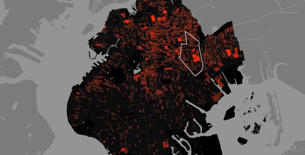
The Million Dollar Blocks project stands out as the most impactful work for me. Laura Kurgan and fellow researchers converted raw social data into an effective map of incarcerated spaces in Brooklyn. By superimposing prison spending data upon geographic as well as demographic data, they found that citizens of a handful of blocks were being incarcerated at a cost of millions. This demonstrates exactly what Professor Legrady's article promotes: such “knowledge discovery” depends on visualizing latent relations between datasets. Here, I argue that the author uses cartography as a form of social critique, making visible to the global community the economic geography of systemic inequality.
- Prison Admissions in Brooklyn
- Prison Expenditures in Brooklyn
- Million Dollar Blocks in Brooklyn's Community District 16
Finally, Home of the Brain is a precursor to exemplary interactive virtual spaces, encouraging users to wander through virtual architecture conceived in the ways of thinking of philosophers such as McLuhan, Derrida, and Foucault. With early VR technologies like Silicon Graphics and the Eyephone interface, this work presents concepts themselves as navigable spaces. Also, it exquisitely shows data as interrelated systems, which allows users to input virtual spaces to create and explore spaces. As an interior designer, this idea interests me greatly—users can directly realize concepts in spaces through a digital medium.
- Home of Brain
-
jcrescenzo
- Posts: 9
- Joined: Wed Oct 01, 2025 2:17 pm
Re: wk4 10.14/10.16: Data, Information Arts, Information, Noise
George Legrady’s Equivalents II is one the earliest examples of users inputting text and natural language to create imagery. Traveling from New York to Europe , this 1992 piece uses algorithmic processes such as fractal mid-point synthesis and Brownian motion to express how text and images can form complimentary or contradictory relationships.
This early precursor to Sora and other image generative capacities demonstrate how text communication with computers can trigger complicated algorithmic protocols to shape the construction of an image. Equivalents II had users input words to produce cloud-like images and generate tonal changes and complexities. Whereas today’s image LLM based generative systems often use de-noising to copy and retrieve pixels from a large database of copyrighted material.
Most importantly, Equivalents II uses a database for tracking user inputs, a crucial ability that current LLMs employ in order to build more context when exchanging text-communication from the user.
Legardy’s piece highlights the development of image generation that has become commonplace in today’s society. At the same time, there remains an inherent gap between human and machine communication and computation, reflecting how natural language isn’t a communication system.
Since the 1990s, tech companies have taken Natural Language, tokenized it and and commercialized it. They employ black boxes around the relationship between text input/prompting and the generative output. This unpredictable mystery of inputs and outputs has led to industries and trades on text prompting. As a result, we are left with terrible interfaces.
The Concept of Language (Noam Chomsky)
https://www.youtube.com/watch?v=hdUbIlwHRkY&t=43s
How AI 'Understands' Images: Computerphile
https://www.youtube.com/watch?v=KcSXcpluDe4&t=311s
Unpredictable Black Boxes are Terrible Interfaces
https://magrawala.substack.com/p/unpred ... e-terrible
Re: wk4 10.14/10.16: Data, Information Arts, Information, Noise
The three artworks I would like to discuss are Listening Post by Mark Hanse & Ben Rubin, Making Visible the Invisible by George Legrady, and Million $ Block Project from Center for Spatial Research. To me, these projects manifest social structures via different forms.
Listening Post (2001) collects real-time text from online chat rooms, analyzes and classifies the conversations by topics, and then animates and sonifies the texts. The words appear on a hanging grid of 231 small digital screens, as well as read by eight synthesized British-accent male voices in the exhibition room. The audience could observe online people discussing politics, religion, gender, relationships, and everyday thoughts. The constantly changing text displays reveal not only personal stories but also larger social and political concerns, such as the statement “I am a Muslim and am afraid of nothing” that appeared during protests against the U.S. invasion of Iraq. It creates a mixed feeling of awe and tension—seeing so many simultaneous conversations from all around the world condensed into a single shared space at a same shared time. The installation invites audiences to reflect on the vast scale of human communication in the digital age and how individual voices form collective patterns of thought and emotion.

Zoom in of the small screens
Making Visible the Invisible similarly studies individual actions that form collective patterns—checking in and out books from the Seattle Central Library. Six large LCD screens are installed behind the library’s main information desk displaying real-time circulation data visualizations. Different visualizations provide with information of item titles, circulation times, classifications and keywords. These pieces of information and various animation together build a continuous, data-driven portrait of the community’s interests. Over time, it could also reflect social changes just within the scope of the library—what topics people read about, how cultural trends shift, and how knowledge circulates among citizens. The project highlights the library as a democratic space where knowledge is freely shared, and reveals invisible patterns of public behavior into a living representation of civic life

Making Visible the Invisible
Million $ Block Project is a project that's in a very different form than the other two. Using a dataset that is rarely accessible to the public, it transforms the U.S. crime and prison spending records into a visual map of neighborhoods. Each “million-dollar block” represents a place where the government spends more than one million dollars a year to imprison people who live there. The map shows how incarceration is not spread evenly—it is concentrated in only a few poor and mostly minority neighborhoods. However, it's not only telling audience where are the most "expensive" communities. Seeing this map, one may wonder what if the money is spent at the same community for education, housing, community service, instead of crime management - What will happen? It helps people see the unequal structure of cities and how geography, race, and policy are deeply connected.
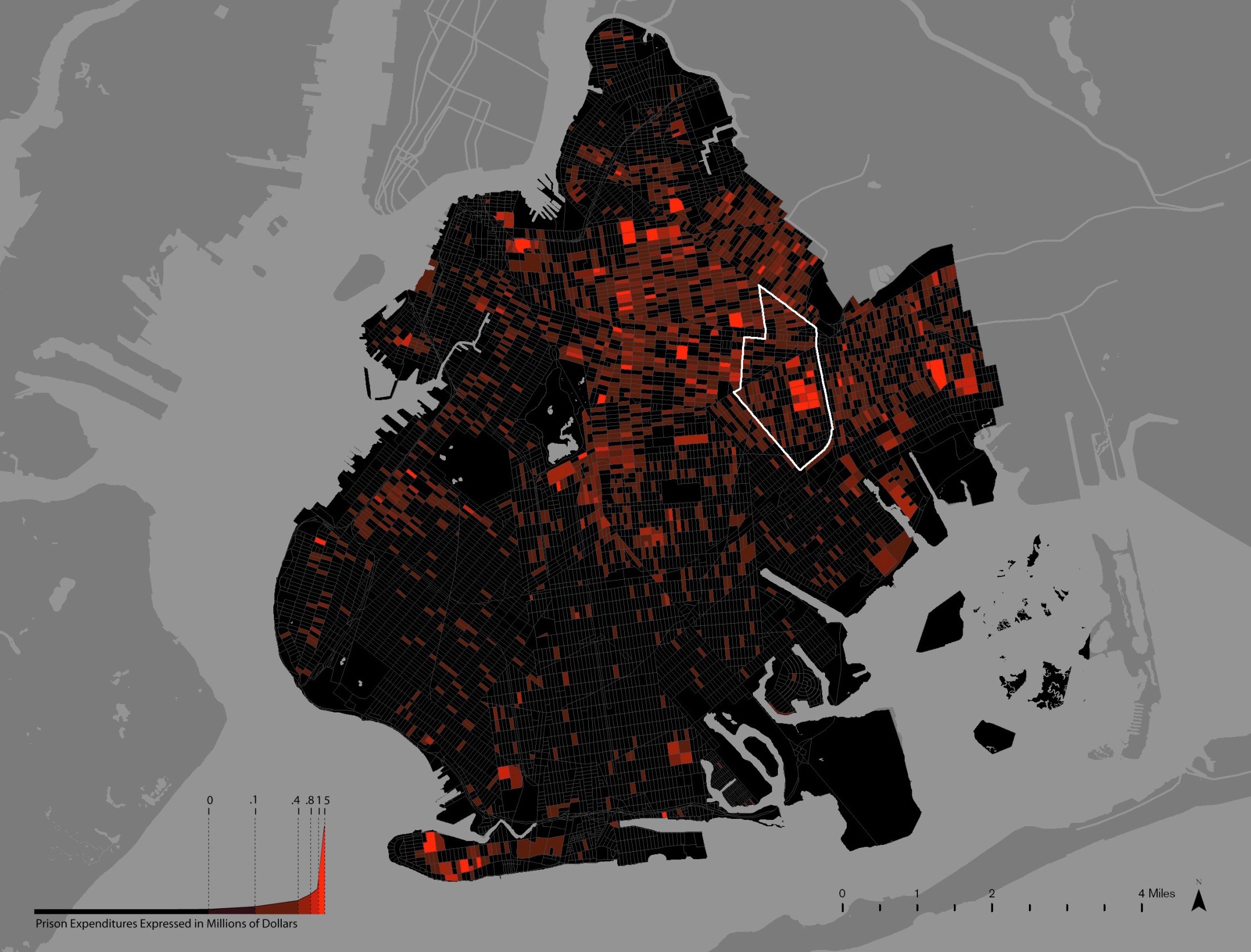
Community District 16 has 3.5% of Brooklyn's population but 8.5% of its prision admissions.
These three works highlight how data can function a reflection of social structures. Each project transforms abstract information into tangible, sensory forms allowing us to perceive the hidden patterns that shapes and be shaped by our modern society. Through their creative use of data, these artworks prompt reflection on how we share information, how we are represented, and ultimately, how equity can be visualized and reimagined.
Listening Post (2001) collects real-time text from online chat rooms, analyzes and classifies the conversations by topics, and then animates and sonifies the texts. The words appear on a hanging grid of 231 small digital screens, as well as read by eight synthesized British-accent male voices in the exhibition room. The audience could observe online people discussing politics, religion, gender, relationships, and everyday thoughts. The constantly changing text displays reveal not only personal stories but also larger social and political concerns, such as the statement “I am a Muslim and am afraid of nothing” that appeared during protests against the U.S. invasion of Iraq. It creates a mixed feeling of awe and tension—seeing so many simultaneous conversations from all around the world condensed into a single shared space at a same shared time. The installation invites audiences to reflect on the vast scale of human communication in the digital age and how individual voices form collective patterns of thought and emotion.
Zoom in of the small screens
Making Visible the Invisible similarly studies individual actions that form collective patterns—checking in and out books from the Seattle Central Library. Six large LCD screens are installed behind the library’s main information desk displaying real-time circulation data visualizations. Different visualizations provide with information of item titles, circulation times, classifications and keywords. These pieces of information and various animation together build a continuous, data-driven portrait of the community’s interests. Over time, it could also reflect social changes just within the scope of the library—what topics people read about, how cultural trends shift, and how knowledge circulates among citizens. The project highlights the library as a democratic space where knowledge is freely shared, and reveals invisible patterns of public behavior into a living representation of civic life
Making Visible the Invisible
Million $ Block Project is a project that's in a very different form than the other two. Using a dataset that is rarely accessible to the public, it transforms the U.S. crime and prison spending records into a visual map of neighborhoods. Each “million-dollar block” represents a place where the government spends more than one million dollars a year to imprison people who live there. The map shows how incarceration is not spread evenly—it is concentrated in only a few poor and mostly minority neighborhoods. However, it's not only telling audience where are the most "expensive" communities. Seeing this map, one may wonder what if the money is spent at the same community for education, housing, community service, instead of crime management - What will happen? It helps people see the unequal structure of cities and how geography, race, and policy are deeply connected.
Community District 16 has 3.5% of Brooklyn's population but 8.5% of its prision admissions.
These three works highlight how data can function a reflection of social structures. Each project transforms abstract information into tangible, sensory forms allowing us to perceive the hidden patterns that shapes and be shaped by our modern society. Through their creative use of data, these artworks prompt reflection on how we share information, how we are represented, and ultimately, how equity can be visualized and reimagined.
-
firving-beck
- Posts: 9
- Joined: Wed Oct 01, 2025 2:26 pm
Re: wk4 10.14/10.16: Data, Information Arts, Information, Noise
With the rise of increased surveillance and presence of big data in our everyday lives, it’s natural that artists are searching for meaning and identity within datasets. Three examples of this are: Alex Dragulescu and Judith Donath's Lexigraphs I (as described within Judith Donath’s written text Data Portraits), Yoon Chung Han’s Digiti Sonus, and George Legrady’s Pockets Full of Memories. These are each very distinct projects, tackling the question of the data-defined self in different ways. To very simply describe each, Data Portraits serves as a visual humanization of data collection, Digiti Sonus sonifies bio data, and Pockets algorithmically categories photographs of viewer possessions. Additionally, each piece uniquely handles the data pipeline -- whereas Lexigraphs transfers digital data to a physical realm, Digiti Sonus and Pockets Full of Memories both digitize physical data.
Donath’s examples of data portraits reveal information about one’s online presence. For example, Lexigraphs, has a human silhouette serving as the visual framework for one’s posting habits. Despite the silhouettes being virtually identical, and thus, not revealing any additional information about the people they represent, this tactic allows us to recognize them as human. Clearly, abstract data does not read as such. This piece allows for visual insight through data collection and its representation. Conceptually, it speaks to the development of self via online presence and interaction (social networking).
Digiti Sonus takes unique biometric data and maps it to sound. We might ask -- does our biological signature encapsulate who we are? It is poetic to be able to generate truly unique waveforms corresponding to each individual. The fingerprint serves as both a societal identity and a marker of selfhood. The imagery is less recognizably “humanoid” than Lexigraphs but still synonymous with the self since fingerprint patterns are understandable to any human. Additionally, the physicality of the visuals makes the piece intrinsically connected to the viewer's idea of their body and embodiment of physical form. Both this piece and Pockets Full of Memories rely on material data rather than digital data collections.
Pockets Full of Memories is relevant to the concept of Renaissance portraiture as described in Data Portraits, where possessions indicate social position. It’s interesting in that it’s a return to an older association of personal objects representing the self, but utilizing algorithmic power and emerging technologies. One of the most striking parts of this installation is how it reveals cultural factors depending on where the exhibit is currently located. Here, one’s surroundings dictate the self. As referenced in the piece description, this is an example of “cultural classification,” via the process of collecting artifacts. It feels deeply personal despite being collective data analytics, especially since the algorithm organizes based on object associations and proximity.
How might we represent identity? Are we a culmination of the thoughts we express, a physical form, or our possessions? Might we consider the traces we leave behind (either physically or digitally) our identity, or is our genetic makeup a truer representation of selfhood?
Donath’s examples of data portraits reveal information about one’s online presence. For example, Lexigraphs, has a human silhouette serving as the visual framework for one’s posting habits. Despite the silhouettes being virtually identical, and thus, not revealing any additional information about the people they represent, this tactic allows us to recognize them as human. Clearly, abstract data does not read as such. This piece allows for visual insight through data collection and its representation. Conceptually, it speaks to the development of self via online presence and interaction (social networking).
- Lexigraphs I (Alex Dragulescu, Judith Donath)
- Digiti Sonus (Yoon Chung Han)
- Pockets Full of Memories (George Legrady
Re: wk4 10.14/10.16: Data, Information Arts, Information, Noise
New information has been widely accessible with the internet. The data stream is continuous and regenerative too, as most of the processes are automated. We can see information about the weather, traffic, people, etc., and can use it in statistical analyses or artistic explorations if we choose to. Data can be transformed into other signals in the case of the latter, which we have seen in many examples the past few weeks. Sensors are a popular way to get a continuous stream of information from our environment. Their output is essentially an input stream that can be manipulated or fed to a system for training purposes to display various things like visualisations, sonifications, or both, depending on the artist.
I like the fact that scientists and artists have different approaches when it comes to data. There is a certain sense of poetry when the main focus is not the numbers themselves. The information transforms into metaphorical or abstract realisations that the audience can interact with instead of reading them on a piece of paper. The aesthetics take priority. This way, even noise in the data can serve a purpose as opposed to how precise scientific methods deal with it. The noise can have its own patterns and behaviour when observed over time. Incomplete or jumbled information due to human errors, system errors, classification errors, etc. is an opportunity to have more variety within the artwork’s mode of display.
Speaking of noise, when we take it literally, Russolo’s futurist manifesto “The Art of Noises” is a good example of how subjective an artist can be about using noise in their work. He was not a musician, but a painter when he came up with the idea that orchestral music was getting boring and that audiences needed new auditory stimulations when listening to music. He talks about how sound was attributed to Gods among “primitives” and that nature was quiet, and that musical art sought out purity and sweetness of sound from the beginning. In his logic, pure sound no longer provoked emotion due to the involvement of machines in our lives. The traditional compositions were monotonous and “primitive”. He constructed various noise instruments that he classified into categories like howlers, roarers, cracklers, bursters, hummers, and whistlers that all had a slightly different way of generating noise.

Mainly rhythmic in nature, these instruments had sounds adjacent to thunders, explosions, hissing, puffing, voices of animals, clangs, and screeches. Various pieces were performed with these instruments integrated into the traditional orchestra, and one of his favourite performances was the one in Milan. Funnily enough though, the audience in Milan had a considerable pushback against this new orchestra, which in turn made Russolo refer to them as “uncivilised beasts”. However, no matter how subjective and pushy the manifesto is, I like the idea of the necessity of noise being free of its constraints so that abstractions can lead the artist to mold it.


In a more visual and theoretical sense, noise is used by Rosa Menkman in her works to offer insights into “otherwise obscure alchemy of standardisation and resolution setting” (https://arts.cern/artist/rosa-menkman/). The noise she focuses on are glitches, encoding, and feedback artefacts that result from accidents in digital and analogue media. Similarly to the Art of Noises, Menkman also has a manifesto called the Glitch Studies. The structure of the paragraphs in this file is unorthodox and very fitting with the content that essentially says seeking perfection in technology and being tied to the “upgrade culture” makes consumers naive. She says “in the beginning there was only noise” and then talks about how artists find ways to use the noise and turn it into opportunities for expression (link to manifesto: https://amodern.net/wp-content/uploads/ ... ifesto.pdf). She compares social conventions to a knowledge membrane and explains the process / mentality of breaking free from the membrane as an artist by refusing to be locked into one medium. That way, the audience of the artist can experience unexpected results. Both Menkman and Russolo embrace a pretty avant-garde concept of noise art.
Finally, I want to focus on a more practical display of unpredictability. The work “mori: an internet-based earthwork” focuses on data from a seismograph as an acoustic installation. The input is the earth fluctuations which are unpredictable. The audio samples are very soundscape-y and atmospheric with no clear melody or rhythm (which makes sense since these are sounds triggered from nature). The interactive element in this is when the audience follows a fiber-optic cable to the centre of the resonating enclosure. There is an embedded visual display in the center as the focal point, and they hear the modulated sounds throughout. This is an experience, in my opinion, that sort of merges some of the ideas mentioned in both Russolo and Menkman’s texts. The focus on “geological endurance” is an interesting way to showcase auditory space in an installation.
I like the fact that scientists and artists have different approaches when it comes to data. There is a certain sense of poetry when the main focus is not the numbers themselves. The information transforms into metaphorical or abstract realisations that the audience can interact with instead of reading them on a piece of paper. The aesthetics take priority. This way, even noise in the data can serve a purpose as opposed to how precise scientific methods deal with it. The noise can have its own patterns and behaviour when observed over time. Incomplete or jumbled information due to human errors, system errors, classification errors, etc. is an opportunity to have more variety within the artwork’s mode of display.
Speaking of noise, when we take it literally, Russolo’s futurist manifesto “The Art of Noises” is a good example of how subjective an artist can be about using noise in their work. He was not a musician, but a painter when he came up with the idea that orchestral music was getting boring and that audiences needed new auditory stimulations when listening to music. He talks about how sound was attributed to Gods among “primitives” and that nature was quiet, and that musical art sought out purity and sweetness of sound from the beginning. In his logic, pure sound no longer provoked emotion due to the involvement of machines in our lives. The traditional compositions were monotonous and “primitive”. He constructed various noise instruments that he classified into categories like howlers, roarers, cracklers, bursters, hummers, and whistlers that all had a slightly different way of generating noise.
Mainly rhythmic in nature, these instruments had sounds adjacent to thunders, explosions, hissing, puffing, voices of animals, clangs, and screeches. Various pieces were performed with these instruments integrated into the traditional orchestra, and one of his favourite performances was the one in Milan. Funnily enough though, the audience in Milan had a considerable pushback against this new orchestra, which in turn made Russolo refer to them as “uncivilised beasts”. However, no matter how subjective and pushy the manifesto is, I like the idea of the necessity of noise being free of its constraints so that abstractions can lead the artist to mold it.
In a more visual and theoretical sense, noise is used by Rosa Menkman in her works to offer insights into “otherwise obscure alchemy of standardisation and resolution setting” (https://arts.cern/artist/rosa-menkman/). The noise she focuses on are glitches, encoding, and feedback artefacts that result from accidents in digital and analogue media. Similarly to the Art of Noises, Menkman also has a manifesto called the Glitch Studies. The structure of the paragraphs in this file is unorthodox and very fitting with the content that essentially says seeking perfection in technology and being tied to the “upgrade culture” makes consumers naive. She says “in the beginning there was only noise” and then talks about how artists find ways to use the noise and turn it into opportunities for expression (link to manifesto: https://amodern.net/wp-content/uploads/ ... ifesto.pdf). She compares social conventions to a knowledge membrane and explains the process / mentality of breaking free from the membrane as an artist by refusing to be locked into one medium. That way, the audience of the artist can experience unexpected results. Both Menkman and Russolo embrace a pretty avant-garde concept of noise art.
Finally, I want to focus on a more practical display of unpredictability. The work “mori: an internet-based earthwork” focuses on data from a seismograph as an acoustic installation. The input is the earth fluctuations which are unpredictable. The audio samples are very soundscape-y and atmospheric with no clear melody or rhythm (which makes sense since these are sounds triggered from nature). The interactive element in this is when the audience follows a fiber-optic cable to the centre of the resonating enclosure. There is an embedded visual display in the center as the focal point, and they hear the modulated sounds throughout. This is an experience, in my opinion, that sort of merges some of the ideas mentioned in both Russolo and Menkman’s texts. The focus on “geological endurance” is an interesting way to showcase auditory space in an installation.