Bio: Edward R. Tufte is Professor Emeritus of Political Science, Statistics, and Computer Science at Yale University; his research centers on statistical evidence and scientific visualization. He is a fellow of the American Statistical Association and the American Academy of Arts and Sciences.
Books:
The Visual Display of Quantitative Information (1983; 2nd ed. 2001), Envisioning Information (1990), Visual Explanations (1997), Beautiful Evidence (2006), and Seeing with Fresh Eyes (2020)
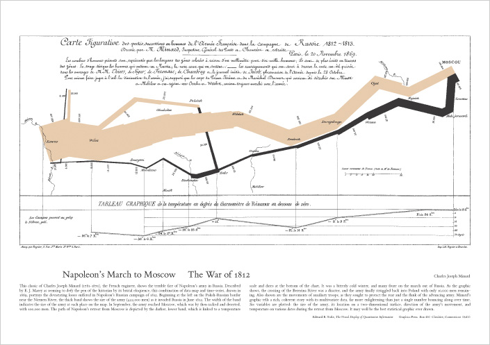
Favorite Example mentioned int the book: Tufte regularly highlights Charles Joseph Minard’s 1869 “Napoleon’s March” as “probably the best statistical graphic ever drawn” for integrating geography, time, temperature, direction, and army size in one view.
From The Visual Display of Quantitative Information (VDQI):
Purpose of statistical graphics: “document data with clarity, precision, and efficiency” and enable quick, truthful analysis.
Graphical integrity: visual changes should be proportional to data changes; Tufte formalizes the Lie Factor to detect exaggeration/minimization (e.g., distorted baselines, pictorial area/volume effects).
Data-ink & chartjunk: maximize data-ink (the non-erasable ink that shows data) and minimize non-data-ink or chartjunk (decorative moirés, heavy grids, 3-D effects). He also warns about “ducks” Graphics where form overwhelms content.
High data density: pack many numbers into a small space without losing legibility; use compact designs to support comparison.
Small multiples: repeat the same design and scale across panels so readers “learn once, compare many.” Essential for fair, fast comparisons across time, categories, or places.
Multivariate displays: prefer designs that carry several variables at once (time-series, relational graphics, data maps, multivariate designs) rather than one-variable-at-a-time plotting.
Layering & separation/micro–macro design: keep scaffolding light (subtle grids, thin rules) and let data sit in the foreground, supporting both quick scanning and close reading.
Words, numbers, pictures together: label at the point of use (direct labels on lines/regions, units, sources) so the figure reads as a self-contained explanation.
Other influential ideas across his work (beyond VDQI):
Sparklines: “small, intense, word-sized graphics” embedded in text and tables—time-series with typographic resolution, not set apart as chart “posters.”
Critique of slide decks: In The Cognitive Style of PowerPoint and related essays, Tufte argues that slide decks can degrade technical reasoning, a concern spotlighted after the Columbia accident analyses. He advocates written technical reports for serious study.
Tufte-style checklist:
Start from the question; choose encodings with the highest accuracy (position/length first; use color sparingly).
Keep Lie Factor ≈ 1; avoid truncated axes and inflated pictograms.
Raise data-ink ratio: delete anything that doesn’t convey data; keep gridlines/frames unobtrusive.
Prefer small multiples for comparisons; keep scales consistent.
Integrate labels, units, and sources into the figure; make it readable at publication size.
Works Viewed:
Tufte, Edward R. The Visual Display of Quantitative Information. 2nd ed., Graphics Press, 2001. EdwardTufte.com, The Visual Display of Quantitative Information. Edward Tufte
“Edward Tufte | Department of Political Science.” Yale University, Edward Tufte | Department of Political Science. Accessed 16 Oct. 2025. politicalscience.yale.edu
“Napoleon’s March.” EdwardTufte.com, Napoleon's March. Accessed 16 Oct. 2025. Edward Tufte
Tufte, Edward R. “Sparkline Theory and Practice.” EdwardTufte.com, 27 May 2004, Sparkline theory and practice Edward Tufte. Edward Tufte
“PowerPoint Does Rocket Science—and Better Techniques for Technical Reports.” EdwardTufte.com, PowerPoint Does Rocket Science--and Better Techniques .... Accessed 16 Oct. 2025. Edward Tufte
Thompson, Clive. “The Great PowerPoint Panic of 2003.” The Atlantic, 23 July 2023, The Great PowerPoint Panic of 2003. The Atlantic