wk4.1 Data Presentations
Please post your 3 minutes data presentation from October 14 here
wk4.1 Data Presentations
wk4.1 Data Presentations
George Legrady
legrady@mat.ucsb.edu
legrady@mat.ucsb.edu
Re: wk4.1 Data Presentations
Pierre Lévy
- A Tunisian-French philosopher and media theorist known for his optimistic view of technology’s impact on humanity.
- Pioneered the concept of Collective Intelligence in 1994 → LINKS technology, culture, and collaboration and how they shape how humanity thinks and learns together.
- In his book Collective Intelligence: Mankind’s Emerging World in Cyberspace (1997), he argues that digital technology can humanise rather than alienate society.
His Key Influences and Ideas
- He envisioned the Internet as a living network of shared human thought.
- Builds on Marshall McLuhan’s “global village” → the idea of interconnected human communication through media.
- His philosophy is also similar to Douglas Engelbart’s concept of “augmenting intelligence” → computers are extensions of human thought, not replacements.
- He envisions a unified human consciousness formed through digital networks.
- An integrated domain that combines human intelligence with the organisational capabilities of the computer.
Concept of the “Knowledge Space”
- He also introduces the idea of a “knowledge space,” where prosperity depends on our ability to navigate, exchange, and renew information in real time ("knowledge has become the new infrastructure”).
The Age of Knowledge + Implications (business and anthropology)
- He suggests that we are transitioning into an age of knowledge, where success depends on being open-minded, collaborative, and flexible.
- In this new age, the constant flow of information sustains organisations and societies (when it stops, they risk collapse/extinction).
- His hypothesis: Rigid systems (e.g. totalitarian governments), fail because they cannot mobilise collective intelligence or adapt to constant change.
--> In the 60s, it became increasingly difficult to inherit the traditions of a trade for an employee
--> Technologies changed rapidly and it became necessary to awaken one’s intelligence to keep pace with it.
--> Subjective mobilisation became a thing → mobilisation (inspire a person to take action) of an individual’s social and cognitive abilities
--> It wasn’t sufficient to passively be a part of a group
--> One needed uniqueness and cooperation to keep up
- This concept also “trickles down” to all layers of society (by a process of capillary motion)
Anthropological Perspective of Collective Creation
He places digital transformation within a broader human evolution of four “anthropological spaces”:
- Earth Space: the nomadic world, tied to nature and myth, hunting and gathering.
- Territorial Space: the agricultural and written world, defined by land and property.
- Commodity Space: the industrial and economic world, driven by production and exchange.
- Digital Space (Fourth Space): the emerging realm where communication, thought, and culture intertwine in continuous collective creation.
Conclusion/Summary
PL believes that the Internet represents a new stage in human evolution (a form of a “collective brain” built from shared human knowledge).
**Collective intelligence is not about technology replacing us, but about humans thinking and creating together on a global scale alongside technology
- The evolving capacity of humans (amplified by the digital) to solve problems together by forming a unified “knowledge space” (co-creating knowledge)
- A “universally distributed intelligence” that grows and coordinates itself in real time through the Internet.
Example:
- People leave traces of knowledge in shared online environments (like Wikipedia).
- Each contribution modifies the collective “memory.”
- Everyone’s input reshapes the shared knowledge base in real time.
References:
https://www.organism.earth/library/docu ... telligence
https://archive.org/details/collectivei ... 9/mode/2up
https://www.cambridge.org/core/services ... igence.pdf
-
jintongyang
- Posts: 10
- Joined: Wed Oct 01, 2025 2:38 pm
Re: wk4.1 Data Presentations
Difference between Data mining & Knowledge Discovery (KDD)
1. Definitions
Both aim to find meaning in data, but KDD is broader, and Data Mining is the core analytical step within the process.
People often mix up these two terms because:
1. Definitions
- Knowledge is more than just raw data or numbers. It means useful patterns, relationships, or insights that help us understand a situation or make better decisions.
- Knowledge Discovery in Databases (KDD) is the entire process of finding such useful knowledge from large amounts of data. It includes collecting, cleaning, transforming, analyzing, and interpreting data to turn it into understanding.
- Data Mining, on the other hand, is the process of extracting patterns from massive datasets using methods from machine learning, statistics, and
database systems.
Both aim to find meaning in data, but KDD is broader, and Data Mining is the core analytical step within the process.
People often mix up these two terms because:
- In industry, the term “Data Mining” became so popular that people started using it to describe the entire process of knowledge discovery.
- KDD actually grew out of early Data Mining research — data mining came first (became popular in the mid 1980s), and KDD (first mentioned in 1989) later expanded the idea into a more systematic process.
- Data Mining produces statistical patterns or models.
- KDD produces understandable, systematic knowledge.
- Data Collection: Record temperature, humidity, and light data from different parts of a city.
- Data Cleaning: Remove errors, missing values, or outliers.
- Data Transformation: map each data dimension to a sound feature (e.g. temperature → pitch, humidity → volume, light → timbre or tone color)
- Data Mining: Analyze the sounds and find patterns (e.g. areas with higher humidity may produce smoother sound textures, or noisy rhythm patterns may indicate unstable weather zones).
- Interpretation: The sound differences reveal daily climate shifts or even patterns of human activity.
-
firving-beck
- Posts: 9
- Joined: Wed Oct 01, 2025 2:26 pm
Re: wk4.1 Data Presentations
Big Data
Origins:
General Definition:
Origins:
- Originated in 1990s, some attribute the term to computer scientist John Mashey. Continues to be increasingly relevant today with the expansion of available data and processing resources
General Definition:
- Extremely large datasets that continue to grow exponentially over time, also with diversity in data types.
- Can include both structured and unstructured data type (e.g. traditional spreadsheets, versus image/audio files, versus sensor data).
The types of data that exist and can be accessed are constantly increasing with the “Internet of things”
- Volume - amount
- Variety - data types
- Velocity - speed at which it can be processed
- Value - worth of info, if it’s meaningful or not
- Veracity - reliability/truthfulness of data
- Variability - changing formats
- Generally the term “big data” is focused on extracting info from these massive datasets: uses mathematical analysis/optimization to identify the laws of very big datasets and look for relationships between variables, such as cause/effect, nonlinear relationships, correlation etc.
- Uses: companies might use to gain insight into consumer trends and customize ads, NSA uses to monitor for threats, can be used in healthcare for screening/diagnosis
- Note: some companies AI to analyze in order to expedite process
- Data processing -> takes a lot of resources due to vast quantity of info
- Storage -> since there’s so much info… often cloud-based solutions are what companies turn to
- Analysis -> can be challenging to find correlations and interesting points to look into with large variety in collected data
- Ethical concerns about consumer information, especially since can be stolen
-
ericmrennie
- Posts: 9
- Joined: Wed Oct 01, 2025 2:33 pm
Re: wk4.1 Data Presentations
The Human Genome Project
The Human Genome Project is one of the greatest scientific feats in history. Taking place from October 1990 until April 2003, it generated the first sequence of the human genome. This accelerated humanity's understanding of human biology while also establishing new norms for research and data transparency. View the slides for more information.
https://docs.google.com/presentation/d/ ... sp=sharing
- Attachments
-
- The Human Genome Project-2.pdf
- (2.19 MiB) Downloaded 1012 times
Last edited by ericmrennie on Tue Oct 21, 2025 6:23 am, edited 1 time in total.
-
lucianparisi
- Posts: 9
- Joined: Thu Sep 26, 2024 2:16 pm
Re: wk4.1 Data Presentations
The FP-Tree (Frequent Pattern Tree) algorithm is a data-mining method for finding patterns that frequently appear together in large datasets.
* Instead of generating and testing many possible item combinations like the older Apriori algorithm, FP-Tree builds a compact tree that stores shared patterns efficiently.
* once built, mine recursively
* KEY: a way to represent large collections of data in a compressed, structured form that makes pattern discovery computationally efficient.
* much more memory efficient than earlier algorithims so crucial for big data
* basis for pattern recognication, clustering, data summarization tasks
FOR MULTIMEDIA WORK
* useful when dealing with large sets of visual, audio, or textual features.
* an image can be represented as a “bag of visual words” (feature descriptors like SIFT or color clusters)
* FP-Tree mining can reveal frequently co-occurring feature patterns across images or video frames.
* helps with content classification, recommendation, and tagging
* useful in AI and ML - not usually used for training models but useful for feature / pattern recognition, useful in generative media AI
* can apply to audio features or video scenes
* While multimedia data is more continuous and complex than transactional data, FP-Tree-based mining provides an interpretable, scalable way to find recurring relationships in large unstructured datasets.
Sources:
* Han, J., Pei, J., & Yin, Y. (2000). Mining frequent patterns without candidate generation. SIGMOD
* Li, T., & Ma, S. (2010). Hybrid medical image classification using association rules and decision trees. arXiv:1001.3503
* Pei, J. et al. (2014). Pattern Mining in Multimedia Data. Springer Handbook of Multimedia Data Mining
-
lpfreiburg
- Posts: 10
- Joined: Wed Oct 01, 2025 2:20 pm
Re: wk4.1 Data Presentations
Bio: Edward R. Tufte is Professor Emeritus of Political Science, Statistics, and Computer Science at Yale University; his research centers on statistical evidence and scientific visualization. He is a fellow of the American Statistical Association and the American Academy of Arts and Sciences.
Books:
The Visual Display of Quantitative Information (1983; 2nd ed. 2001), Envisioning Information (1990), Visual Explanations (1997), Beautiful Evidence (2006), and Seeing with Fresh Eyes (2020)
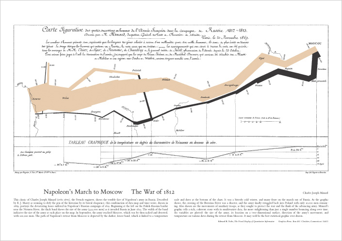
Favorite Example mentioned int the book: Tufte regularly highlights Charles Joseph Minard’s 1869 “Napoleon’s March” as “probably the best statistical graphic ever drawn” for integrating geography, time, temperature, direction, and army size in one view.
From The Visual Display of Quantitative Information (VDQI):
Purpose of statistical graphics: “document data with clarity, precision, and efficiency” and enable quick, truthful analysis.
Graphical integrity: visual changes should be proportional to data changes; Tufte formalizes the Lie Factor to detect exaggeration/minimization (e.g., distorted baselines, pictorial area/volume effects).
Data-ink & chartjunk: maximize data-ink (the non-erasable ink that shows data) and minimize non-data-ink or chartjunk (decorative moirés, heavy grids, 3-D effects). He also warns about “ducks” Graphics where form overwhelms content.
High data density: pack many numbers into a small space without losing legibility; use compact designs to support comparison.
Small multiples: repeat the same design and scale across panels so readers “learn once, compare many.” Essential for fair, fast comparisons across time, categories, or places.
Multivariate displays: prefer designs that carry several variables at once (time-series, relational graphics, data maps, multivariate designs) rather than one-variable-at-a-time plotting.
Layering & separation/micro–macro design: keep scaffolding light (subtle grids, thin rules) and let data sit in the foreground, supporting both quick scanning and close reading.
Words, numbers, pictures together: label at the point of use (direct labels on lines/regions, units, sources) so the figure reads as a self-contained explanation.
Other influential ideas across his work (beyond VDQI):
Sparklines: “small, intense, word-sized graphics” embedded in text and tables—time-series with typographic resolution, not set apart as chart “posters.”
Critique of slide decks: In The Cognitive Style of PowerPoint and related essays, Tufte argues that slide decks can degrade technical reasoning, a concern spotlighted after the Columbia accident analyses. He advocates written technical reports for serious study.
Tufte-style checklist:
Start from the question; choose encodings with the highest accuracy (position/length first; use color sparingly).
Keep Lie Factor ≈ 1; avoid truncated axes and inflated pictograms.
Raise data-ink ratio: delete anything that doesn’t convey data; keep gridlines/frames unobtrusive.
Prefer small multiples for comparisons; keep scales consistent.
Integrate labels, units, and sources into the figure; make it readable at publication size.
Works Viewed:
Tufte, Edward R. The Visual Display of Quantitative Information. 2nd ed., Graphics Press, 2001. EdwardTufte.com, The Visual Display of Quantitative Information. Edward Tufte
“Edward Tufte | Department of Political Science.” Yale University, Edward Tufte | Department of Political Science. Accessed 16 Oct. 2025. politicalscience.yale.edu
“Napoleon’s March.” EdwardTufte.com, Napoleon's March. Accessed 16 Oct. 2025. Edward Tufte
Tufte, Edward R. “Sparkline Theory and Practice.” EdwardTufte.com, 27 May 2004, Sparkline theory and practice Edward Tufte. Edward Tufte
“PowerPoint Does Rocket Science—and Better Techniques for Technical Reports.” EdwardTufte.com, PowerPoint Does Rocket Science--and Better Techniques .... Accessed 16 Oct. 2025. Edward Tufte
Thompson, Clive. “The Great PowerPoint Panic of 2003.” The Atlantic, 23 July 2023, The Great PowerPoint Panic of 2003. The Atlantic
Books:
The Visual Display of Quantitative Information (1983; 2nd ed. 2001), Envisioning Information (1990), Visual Explanations (1997), Beautiful Evidence (2006), and Seeing with Fresh Eyes (2020)
Favorite Example mentioned int the book: Tufte regularly highlights Charles Joseph Minard’s 1869 “Napoleon’s March” as “probably the best statistical graphic ever drawn” for integrating geography, time, temperature, direction, and army size in one view.
From The Visual Display of Quantitative Information (VDQI):
Purpose of statistical graphics: “document data with clarity, precision, and efficiency” and enable quick, truthful analysis.
Graphical integrity: visual changes should be proportional to data changes; Tufte formalizes the Lie Factor to detect exaggeration/minimization (e.g., distorted baselines, pictorial area/volume effects).
Data-ink & chartjunk: maximize data-ink (the non-erasable ink that shows data) and minimize non-data-ink or chartjunk (decorative moirés, heavy grids, 3-D effects). He also warns about “ducks” Graphics where form overwhelms content.
High data density: pack many numbers into a small space without losing legibility; use compact designs to support comparison.
Small multiples: repeat the same design and scale across panels so readers “learn once, compare many.” Essential for fair, fast comparisons across time, categories, or places.
Multivariate displays: prefer designs that carry several variables at once (time-series, relational graphics, data maps, multivariate designs) rather than one-variable-at-a-time plotting.
Layering & separation/micro–macro design: keep scaffolding light (subtle grids, thin rules) and let data sit in the foreground, supporting both quick scanning and close reading.
Words, numbers, pictures together: label at the point of use (direct labels on lines/regions, units, sources) so the figure reads as a self-contained explanation.
Other influential ideas across his work (beyond VDQI):
Sparklines: “small, intense, word-sized graphics” embedded in text and tables—time-series with typographic resolution, not set apart as chart “posters.”
Critique of slide decks: In The Cognitive Style of PowerPoint and related essays, Tufte argues that slide decks can degrade technical reasoning, a concern spotlighted after the Columbia accident analyses. He advocates written technical reports for serious study.
Tufte-style checklist:
Start from the question; choose encodings with the highest accuracy (position/length first; use color sparingly).
Keep Lie Factor ≈ 1; avoid truncated axes and inflated pictograms.
Raise data-ink ratio: delete anything that doesn’t convey data; keep gridlines/frames unobtrusive.
Prefer small multiples for comparisons; keep scales consistent.
Integrate labels, units, and sources into the figure; make it readable at publication size.
Works Viewed:
Tufte, Edward R. The Visual Display of Quantitative Information. 2nd ed., Graphics Press, 2001. EdwardTufte.com, The Visual Display of Quantitative Information. Edward Tufte
“Edward Tufte | Department of Political Science.” Yale University, Edward Tufte | Department of Political Science. Accessed 16 Oct. 2025. politicalscience.yale.edu
“Napoleon’s March.” EdwardTufte.com, Napoleon's March. Accessed 16 Oct. 2025. Edward Tufte
Tufte, Edward R. “Sparkline Theory and Practice.” EdwardTufte.com, 27 May 2004, Sparkline theory and practice Edward Tufte. Edward Tufte
“PowerPoint Does Rocket Science—and Better Techniques for Technical Reports.” EdwardTufte.com, PowerPoint Does Rocket Science--and Better Techniques .... Accessed 16 Oct. 2025. Edward Tufte
Thompson, Clive. “The Great PowerPoint Panic of 2003.” The Atlantic, 23 July 2023, The Great PowerPoint Panic of 2003. The Atlantic
-
lpfreiburg
- Posts: 10
- Joined: Wed Oct 01, 2025 2:20 pm
Re: wk4.1 Data Presentations
Bio: Edward R. Tufte is Professor Emeritus of Political Science, Statistics, and Computer Science at Yale University; his research centers on statistical evidence and scientific visualization. He is a fellow of the American Statistical Association and the American Academy of Arts and Sciences.
Books:
The Visual Display of Quantitative Information (1983; 2nd ed. 2001), Envisioning Information (1990), Visual Explanations (1997), Beautiful Evidence (2006), and Seeing with Fresh Eyes (2020)
Favorite Example mentioned int the book: Tufte regularly highlights Charles Joseph Minard’s 1869 “Napoleon’s March” as “probably the best statistical graphic ever drawn” for integrating geography, time, temperature, direction, and army size in one view.
From The Visual Display of Quantitative Information:
Purpose of statistical graphics: “document data with clarity, precision, and efficiency” and enable quick, truthful analysis.
Graphical integrity: visual changes should be proportional to data changes; Tufte formalizes the Lie Factor to detect exaggeration/minimization (e.g., distorted baselines, pictorial area/volume effects).
Data-ink & chartjunk: maximize data-ink (the non-erasable ink that shows data) and minimize non-data-ink or chartjunk (decorative moirés, heavy grids, 3-D effects). He also warns about “ducks” Graphics where form overwhelms content.
High data density: pack many numbers into a small space without losing legibility; use compact designs to support comparison.
Small multiples: repeat the same design and scale across panels so readers “learn once, compare many.” Essential for fair, fast comparisons across time, categories, or places.
Multivariate displays: prefer designs that carry several variables at once (time-series, relational graphics, data maps, multivariate designs) rather than one-variable-at-a-time plotting.
Layering and separation/micro–macro design: keep scaffolding light (subtle grids, thin rules) and let data sit in the foreground, supporting both quick scanning and close reading.
Words, numbers, pictures together: label at the point of use (direct labels on lines/regions, units, sources) so the figure reads as a self-contained explanation.
Other influential ideas:
Sparklines: “small, intense, word-sized graphics” embedded in text and tables—time-series with typographic resolution, not set apart as chart “posters.”
Critique of slide decks: In The Cognitive Style of PowerPoint and related essays, Tufte argues that slide decks can degrade technical reasoning, a concern spotlighted after the Columbia accident analyses. He advocates written technical reports for serious study.
Tufte-style checklist:
Start from the question; choose encodings with the highest accuracy (position/length first; use color sparingly).
Keep Lie Factor ≈ 1; avoid truncated axes and inflated pictograms.
Raise data-ink ratio: delete anything that doesn’t convey data; keep gridlines/frames unobtrusive.
Prefer small multiples for comparisons; keep scales consistent.
Integrate labels, units, and sources into the figure; make it readable at publication size.
Works Viewed:
Tufte, Edward R. The Visual Display of Quantitative Information. 2nd ed., Graphics Press, 2001. EdwardTufte.com, The Visual Display of Quantitative Information. Edward Tufte
“Edward Tufte | Department of Political Science.” Yale University, Edward Tufte | Department of Political Science. Accessed 16 Oct. 2025. politicalscience.yale.edu
“Napoleon’s March.” EdwardTufte.com, Napoleon's March. Accessed 16 Oct. 2025. Edward Tufte
Tufte, Edward R. “Sparkline Theory and Practice.” EdwardTufte.com, 27 May 2004, Sparkline theory and practice Edward Tufte. Edward Tufte
“PowerPoint Does Rocket Science—and Better Techniques for Technical Reports.” EdwardTufte.com, PowerPoint Does Rocket Science--and Better Techniques .... Accessed 16 Oct. 2025. Edward Tufte
Thompson, Clive. “The Great PowerPoint Panic of 2003.” The Atlantic, 23 July 2023, The Great PowerPoint Panic of 2003. The Atlantic
Last edited by lpfreiburg on Thu Oct 16, 2025 12:15 pm, edited 3 times in total.
Re: wk4.1 Data Presentations
I chose the topic is Creative Commons, or CC for short.
Creative Commons is an international nonprofit organization that helps people share knowledge and creativity freely and responsibly. I think that. It was created because in the digital age, sharing content is easy — but copyright laws can often make it complicated. So instead of “All Rights Reserved,” Creative Commons introduced the idea of “Some Rights Reserved.” That means creators can decide how others can use their work.
For example, if you take a beautiful picture and choose a CC BY–N–C license (that means ‘Attribution, Non-Commercial’), other people can reuse your photo as long as they credit you as the creator and don’t use it for commercial purposes. Or, if you choose a CC BY-SA (Attribution–ShareAlike) license, others can remix or modify your work, but they must share their new creation under the same open terms, so the spirit of sharing continues.
What I find really interesting about Creative Commons is that it’s not just about copyright — it’s actually about building a culture of sharing. In nowadays, era, sharing is important and can benefit everyone.
So I think it is very important for us, MAT, a kind of interdisciplinary field, since we always create works that include many elements, like sound, image, programming, and installation art.
And their mission is to give people the legal and technical tools to make this possible — like the CC licenses that we often see under images, videos, and even open-source projects.
Re: wk4.1 Data Presentations
Microsoft Photosynth is an experimental technology developed in the mid-2000s.
Photosynth was a system that could reconstruct three-dimensional spaces from ordinary two-dimensional photographs.
In other words, it transformed flat images into immersive, navigable 3D environments — something quite revolutionary at the time.
Photosynth was based on an algorithm called Structure-from-Motion, or SfM.
This technique compares multiple overlapping photos, detects common feature points, and calculates the relative position of those points and the camera angles that captured them. Through this process, it generates a 3D point cloud. This meant users could not only flip through photos, but actually move through the reconstructed 3D space, as if exploring it physically.
For example, when people uploaded photos of a tourist site from different angles, Photosynth could automatically combine them to recreate that site in virtual space.
It was a fascinating fusion of human perception and computer vision.
It’s important to note that Photosynth was not a 360-degree panorama viewer like Google Street View.
While Street View simply stitches multiple panoramic images to look three-dimensional,
Photosynth actually analyzed the photos to calculate real 3D spatial data.
Although Microsoft discontinued Photosynth in 2017,
its technology and vision lived on in later developments such as 3D scanning, photogrammetry, and metaverse or VR reconstruction tools.
Even though the platform itself no longer exists,
Photosynth remains one of the first major attempts to turn digital photographs into spatial data accessible to the public.
Photosynth explored how photography can connect memory, space, and collective human perspective in a new way.[/list][/list]