1. Wind Map: 
Even though we have been looking at many versions of maps on the weather channel. I liked the colors chosen to represent the wind flow, which makes the live interactions subtle, but also denotes the idea that there are only a few layers of main representation among the natural elements. It made me feel how life or living things are, and how non-living things feel more natural. And they make one gaze at the landscapes with varying wind flow and feel the fact that there is so much happening and that act is bound in such a meaningful way. This is important because the idea of completion occurs a step before something achieves permanency. This can be observed in the above art, and it teaches such an important lesson. 
The live data makes it extremely functional and useful at the same time. 
The Wind Map caught my eye for its ease of interactive ability of the useful data, and 
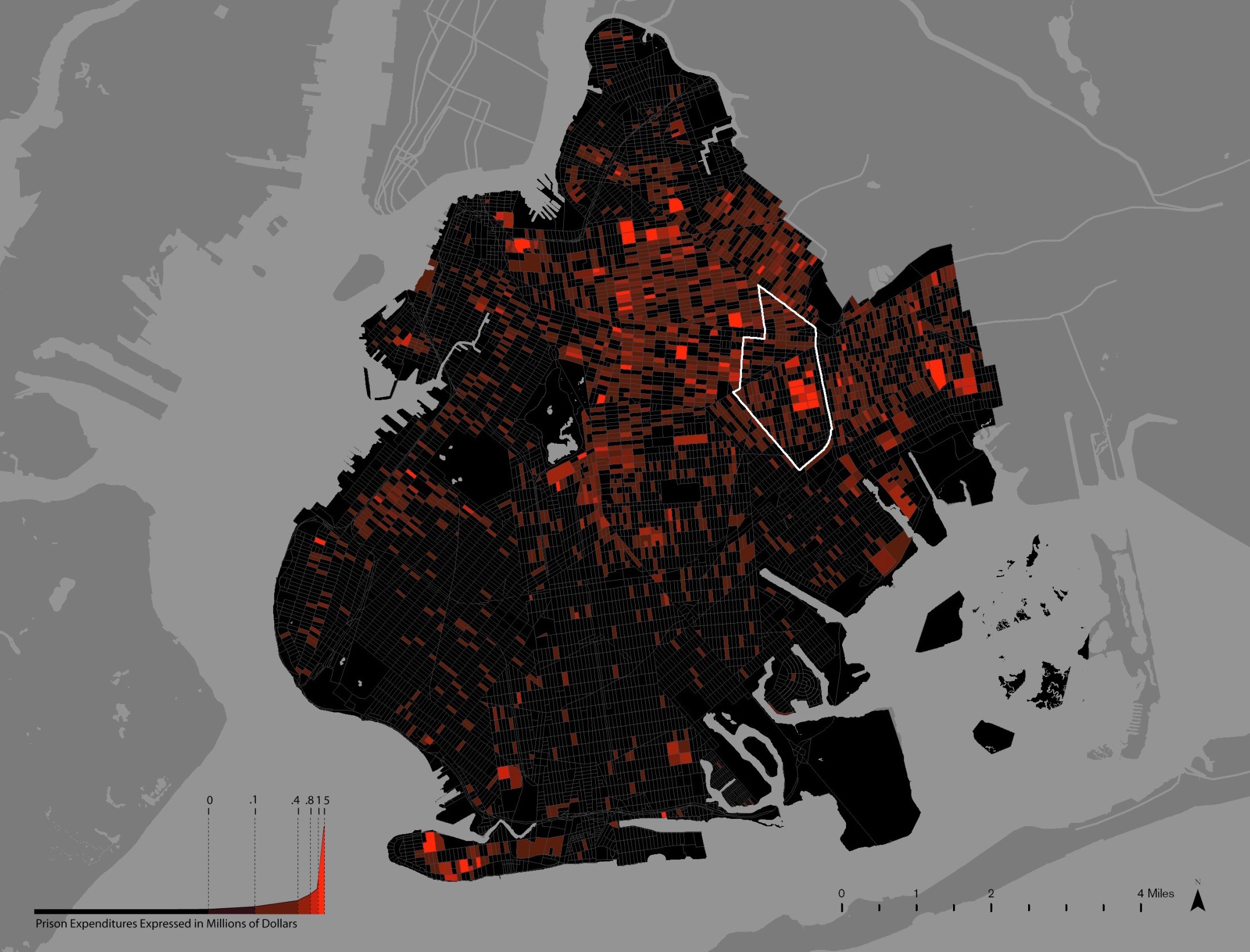
2.  Million Dollar Blocks by Center for Spatial Research Main navigation
This is nothing but a fake claim, or it could be a mirroring of a lie. 
This work is an example of unethical use of both the data and metadata to trigger a biased notion in the audience.
Although the research labs mention that the data represented is backed by the statement saying that "... analytical and graphical techniques within the research and teaching environment of the Spatial Information Design Lab, which can then be applied to real-life policy initiatives through work with the JFA Institute." The use case and its dimension are not explained either in the article or through the Art.
It more of looks like a biased representation made on how much money is looted and wasted in the name of incarcerating the culprits. The amount of money invested could have been used towards improving the area's infrastructure, education, health, and living experiences, which would have been much more useful. On top of that, expressing and defending the idea that investment in these areas has resulted in significant costs to other elements of our civic infrastructure, such as education, housing, health, and family, is another wrong and false representation made using the metadata. The 
To continue, the artwork deals with such an important topic and uses sensitive data, yet it doesn't give justification for the numbers claimed, which also makes the artwork incomplete, and there is nothing impressive, beautiful, or even useful (if not damaging) about the 
But one can always argue that the purpose of the art itself could be to make me realize how the governing body is selling lies in the name of making our society a better place. 
3. The Secret Life of Numbers
Actual link - https://flong.com/archive/projects/slon/index.html 
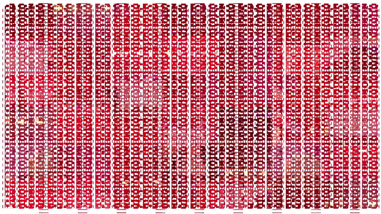
The Secret Life of Numbers is an interesting work made in establishing and understanding the already established connections, which makes us think, how did we make the interesting interconnections similar to the number system unknowingly? Or what is it trying to say? But I also felt the work could have been expanded more towards an interesting visualization rather than a practical display of numbers represented mostly through the bar graphs. The information visualization could have been interconnected with the one other eco-system that follow the same relation dynamics.
But I learnt a valuable lesson on how many layers one has to make before making the call. 
In the three mentioned artworks, I found the similarity with how the connection between some materialistic, non-living but interactive elements mirrors the entire ecosystem that exists around them. Like how the flow, interaction, and existence of wind, numbers, and money mirror the living elements and their society, group, and interactions of humans, animals, and plants. This makes one wonder what is main reason to all this.


						wk4 10.14/10.16: Data, Information Arts, Information, Noise
- 
				shashank86
 - Posts: 5
 - Joined: Wed Oct 01, 2025 2:36 pm
 
Re: wk4 10.14/10.16: Data, Information Arts, Information, Noise
We live surrounded by countless streams of data, often without realizing it. At this very moment, weather observations, biometric readings from smartwatches, credit card transactions, and electricity consumption records are continuously being collected. Yet this endless procession of numbers remains meaningless if left uninterpreted, merely fragments stored in memory without context. People often consider working with data as a dry technical task, but the same dataset can be turned into a poem or a report. Ultimately, the meaning of data depends on the intention and perspective of the one who handles it. Until I encountered the following artists’ works, I was unsure how to distinguish between data visualization and data-based art. However, through my research, I came to develop my own understanding of their difference.
So, how does data visualization in science and industry differ from the approach of art?
Data art explores the poetic potential of data. It discovers patterns within massive datasets and reveals their underlying structures in sensory and critical ways. While it shares data science’s curiosity about uncovering hidden knowledge, it diverges by reflecting on the very act of processing data itself. This approach aligns with a method of data mining known as Knowledge Discovery in Databases (KDD), which produces insights not by seeking predefined answers but by identifying anomalies, inconsistencies, and distortions within classification systems (Legrady, “Big Data: From Data to Metadata,” Bloomsbury Encyclopedia of New Media Art, 2024). Through this unpredictable process, artists expose the errors, imbalances, and biases embedded in systems, revealing the social realities and power structures hidden beneath the surface of numerical information.
For example, Lynn Hershman Leeson’s Shadow Stalker (2018–2019) is an interactive installation in which visitors enter their email addresses and an algorithm generates their “digital shadow.” By visualizing the predictive process of data analysis, the work exposes algorithmic bias and the asymmetry of data power that pervades our society.

Hassan Elahi’s Tracking Transience (2003–present) documents every detail of the artist’s daily life—his movements, meals, and accommodations—after he was mistakenly placed on a terrorist watch list following 9/11. By voluntarily participating in the surveillance system, Elahi ironically neutralizes its authority.

Meanwhile, Laura Kurgan and collaborators’ Million Dollar Blocks (2004–) maps the home addresses of incarcerated individuals and the cost of their imprisonment onto GIS-based visualizations. The project reveals that certain city blocks consume over a million dollars annually in prison-related expenses, exposing how the penal system disproportionately drains resources from poor and minority communities. Through data, it visualizes structural violence and socio-economic inequality.

In this way, artistic uses of data go far beyond mere visualization or sonification. They aim to uncover the invisible systems behind information itself. Data art becomes an act of revealing. The artist intervenes within the flow of data to expose hidden mechanisms and open possibilities for audiences to perceive the realities concealed beneath numbers.


						So, how does data visualization in science and industry differ from the approach of art?
Data art explores the poetic potential of data. It discovers patterns within massive datasets and reveals their underlying structures in sensory and critical ways. While it shares data science’s curiosity about uncovering hidden knowledge, it diverges by reflecting on the very act of processing data itself. This approach aligns with a method of data mining known as Knowledge Discovery in Databases (KDD), which produces insights not by seeking predefined answers but by identifying anomalies, inconsistencies, and distortions within classification systems (Legrady, “Big Data: From Data to Metadata,” Bloomsbury Encyclopedia of New Media Art, 2024). Through this unpredictable process, artists expose the errors, imbalances, and biases embedded in systems, revealing the social realities and power structures hidden beneath the surface of numerical information.
For example, Lynn Hershman Leeson’s Shadow Stalker (2018–2019) is an interactive installation in which visitors enter their email addresses and an algorithm generates their “digital shadow.” By visualizing the predictive process of data analysis, the work exposes algorithmic bias and the asymmetry of data power that pervades our society.

Hassan Elahi’s Tracking Transience (2003–present) documents every detail of the artist’s daily life—his movements, meals, and accommodations—after he was mistakenly placed on a terrorist watch list following 9/11. By voluntarily participating in the surveillance system, Elahi ironically neutralizes its authority.

Meanwhile, Laura Kurgan and collaborators’ Million Dollar Blocks (2004–) maps the home addresses of incarcerated individuals and the cost of their imprisonment onto GIS-based visualizations. The project reveals that certain city blocks consume over a million dollars annually in prison-related expenses, exposing how the penal system disproportionately drains resources from poor and minority communities. Through data, it visualizes structural violence and socio-economic inequality.

In this way, artistic uses of data go far beyond mere visualization or sonification. They aim to uncover the invisible systems behind information itself. Data art becomes an act of revealing. The artist intervenes within the flow of data to expose hidden mechanisms and open possibilities for audiences to perceive the realities concealed beneath numbers.
- 
				lucianparisi
 - Posts: 4
 - Joined: Thu Sep 26, 2024 2:16 pm
 
Re: wk4 10.14/10.16: Data, Information Arts, Information, Noise
What stands out across George’s article and the works I will discuss is the concept of identity emerging through data and noise. 
[eCLOUD]
This project integrates several relevant concepts to our field. The data is sources by realtime natural phenomenon in the world. Weather patterns are seemingly both organized and sporadic. Even with noisy weather data, our minds become fixated on pattern formation, and can serve as a sort of Rorschach for our own emotional projections.

[Signal to Noise (Software 1)]
Casey Reas’ work deals with George’s concept of data as “raw material” for artistic practice. “Signal Noise” takes ordinary television signals, a pervasive medium in our culture, and distorts them unrecognizably. In this distorted state, the data appears as pure noise with emergent pattern behavior. Behaviors that emerge result in a shared identity across different source signals.

1:1
Lisa Jevbratt’s 1:1 created a long term data bass of the growth of website addresses on the internet. The work provides different algorithms for interfacing with the databases, changing the perceived patterns that emerge. The interfaces (Migration, Hierarchical, Every, Random, Excursion) visualize each algorithm in a unique way. These visualizations are a different means for exploring this muddled source of information than our traditional search engines or browser. Each interface has its own identify created by sifting through noise.


						[eCLOUD]
This project integrates several relevant concepts to our field. The data is sources by realtime natural phenomenon in the world. Weather patterns are seemingly both organized and sporadic. Even with noisy weather data, our minds become fixated on pattern formation, and can serve as a sort of Rorschach for our own emotional projections.

[Signal to Noise (Software 1)]
Casey Reas’ work deals with George’s concept of data as “raw material” for artistic practice. “Signal Noise” takes ordinary television signals, a pervasive medium in our culture, and distorts them unrecognizably. In this distorted state, the data appears as pure noise with emergent pattern behavior. Behaviors that emerge result in a shared identity across different source signals.
1:1
Lisa Jevbratt’s 1:1 created a long term data bass of the growth of website addresses on the internet. The work provides different algorithms for interfacing with the databases, changing the perceived patterns that emerge. The interfaces (Migration, Hierarchical, Every, Random, Excursion) visualize each algorithm in a unique way. These visualizations are a different means for exploring this muddled source of information than our traditional search engines or browser. Each interface has its own identify created by sifting through noise.
- 
				lpfreiburg
 - Posts: 6
 - Joined: Wed Oct 01, 2025 2:20 pm
 
Re: wk4 10.14/10.16: Data, Information Arts, Information, Noise
In this era, an artwork is not only a picture or an object, but can also be a schema, a database, or a recomposition of a flow. Legrady's "Big Data: From Data to Meta Data" explains why: once images, sounds, and texts become digital, they are integrated into an economy of information whose value lies in how well things can be indexed, related, and recombined. What emerges clearly from these materials is that seeing in the digital era is no longer simple seeing: it is always already sorting.
In the 'Electric Op' context, these mohaired fields are not merely decorative but early experiments in frequency spectrums, in what constitutes usable signal and what spills over into visual noise; Menkman follows in her footsteps, if at the level of codecs and resolution instead of stripes and gradients. Electric Op is of value because it explains pre-digital genealogies; the op-artists of the Sixties already were testing what happens when a visual channel was overloaded by too much contrast, repetition, or frequency; their images flicker because the eye is being pushed to visualize more information than it comfortably can.
Then Legrady's art&noise provides the vocabulary for connecting these dots. If the signal is what the system expects, the noise is what the system does not like, and yet the noise is also the moment at which the system can be seen. The art of Eline Menkman exploits this moment: a blurred PAL frame, a crushed JPEG, a scrambled color space, all of which reveal the medium more clearly than a well-encoded video can.
One can formulate it this way (which is why the result belongs to Week 4, Data, Information, Noise): data provides the material, metadata offers the structure, and noise (visual, optical, codec-level) provides the insight. Good information art fights against all three of them. (1) The operant systems, which are presented as experimental, produce a kind of overload at the level of perception; (2) "Big Data" explains that once everything is digitized, the whole artistic question will be the organization, labelling and displaying of the information overload; (3) Menkman and Legrady's noise article shows how, when organization fails or is deliberately and purposely broken, the fundamental rules of the system itself are exposed.
Works Cited
Buffalo AKG Art Museum. "Electric Op." Buffalo AKG, 27 Sept. 2024–27 Jan. 2025. Accessed 26 Oct. 2025.
Buffalo AKG Art Museum
Legrady, George. "Big Data: From Data to Metadata." The Bloomsbury Encyclopedia of New Media Art, 2024. Accessed 26 Oct. 2025.
ResearchGate
Legrady, George. "Art & Noise." UCSB Media Arts & Technology course materials, 2025. Accessed 26 Oct. 2025.
Media Arts and Technology
"Rosa Menkman." Arts at CERN, https://arts.cern/artist/rosa-menkman/
. Accessed 26 Oct. 2025. arts.cern


						In the 'Electric Op' context, these mohaired fields are not merely decorative but early experiments in frequency spectrums, in what constitutes usable signal and what spills over into visual noise; Menkman follows in her footsteps, if at the level of codecs and resolution instead of stripes and gradients. Electric Op is of value because it explains pre-digital genealogies; the op-artists of the Sixties already were testing what happens when a visual channel was overloaded by too much contrast, repetition, or frequency; their images flicker because the eye is being pushed to visualize more information than it comfortably can.
Then Legrady's art&noise provides the vocabulary for connecting these dots. If the signal is what the system expects, the noise is what the system does not like, and yet the noise is also the moment at which the system can be seen. The art of Eline Menkman exploits this moment: a blurred PAL frame, a crushed JPEG, a scrambled color space, all of which reveal the medium more clearly than a well-encoded video can.
One can formulate it this way (which is why the result belongs to Week 4, Data, Information, Noise): data provides the material, metadata offers the structure, and noise (visual, optical, codec-level) provides the insight. Good information art fights against all three of them. (1) The operant systems, which are presented as experimental, produce a kind of overload at the level of perception; (2) "Big Data" explains that once everything is digitized, the whole artistic question will be the organization, labelling and displaying of the information overload; (3) Menkman and Legrady's noise article shows how, when organization fails or is deliberately and purposely broken, the fundamental rules of the system itself are exposed.
Works Cited
Buffalo AKG Art Museum. "Electric Op." Buffalo AKG, 27 Sept. 2024–27 Jan. 2025. Accessed 26 Oct. 2025.
Buffalo AKG Art Museum
Legrady, George. "Big Data: From Data to Metadata." The Bloomsbury Encyclopedia of New Media Art, 2024. Accessed 26 Oct. 2025.
ResearchGate
Legrady, George. "Art & Noise." UCSB Media Arts & Technology course materials, 2025. Accessed 26 Oct. 2025.
Media Arts and Technology
"Rosa Menkman." Arts at CERN, https://arts.cern/artist/rosa-menkman/
. Accessed 26 Oct. 2025. arts.cern
- 
				felix_yuan
 - Posts: 5
 - Joined: Wed Oct 01, 2025 2:40 pm
 
Re: wk4 10.14/10.16: Data, Information Arts, Information, Noise
From Data to Noise. From Collecting to Imagination
Data, or information, as a fundamental element in human life, reflect both subjective fact but can be a playground of subjective perception, or imagination. Artistic approach to working with data, Big Data, and streaming data may be summarized in the following ways: (a) an emphasis on alternative modes of enquiry, (b) innovation and complexity in visualizations and representation and (c) play of the imagination. [https://www.mat.ucsb.edu/~g.legrady/aca ... igdata.pdf] Noise, which can be considered as random data, can also be used as a material for artistic expression. To fully make a insight of artwork on data, information and noise, it is important to identify the artist’s intension in collecting, organizing data or generating noise, and the approach used to retrieve information or discovering knowledge, to fully understand the impact of the final outcome.
Data
By using data, Big Data, or internet based data and streaming data, and through organization and inspection, we can get some hidden facts, information and knowledge thought data organization and further analysis.
Mori and The Telegarden by Ken Goldberg created interesting effect by using innovative approach to present data. In Mori, the seismic waves, as a form of digital signal, are transformed into a multi-modal art installation where audience can sit in the room and feel the waves through the sound and the sense of space. The Telegarden, through the approach of data internet streaming, transmitted people’s thought into a cooperative interactive experience where people can slowdown to build a garden together through the rapid internet data streaming flow. [https://goldberg.berkeley.edu/]
The Photosynth software by Microsoft, launched in 2008 is a scene reconstruction modeling tool using photo as 2D data points to construct the 3D scene. The software analyze the multiple pictures taken in the same area using an interest point detection and matching algorithm and identify the relationship among the photos to rearrange them according to their features through the process or bundle adjustment. Then the program display the photo in their original place in the scene through the 3D point cloud of the features and build up the 3D space while providing a navigable experience using DeepZoom and Seadragon technology. [https://en.wikipedia.org/wiki/Photosynth] Though these two steps, the 2D data points, i.e. the photos, comes together to present the 3D space and the photographer’s original standing point, revealing higher dimensional information than the original dataset.
Hasan Elahi use his the data of his everyday’s life that he’s forced to collect after being misidentified as a terrorist in the project Tracking Transience. He collected and categorized everything he logged in his life including every place he had been to, every meal he had had or even every toilet he had used and so on. The project revealed a different point of view of not only how we can see through the artist’s life through the data trace we left, but also a point of view of how we can see, judge or feel about one’s life through a through a monitor’s view, a view transcendent of privacy, and the difference of how our life could look like from our own experience and the data trace we left behind.
[https://history.siggraph.org/artwork/ha ... ransience/]
The data in the Tracking Transience is collected from not particular picked way, and sometimes look random or odd, and is in smaller amount comparing to Big Data, but we get to know certain knowledge of the artist’s life, which is a relatively much more complex identity. Imagine we collect similar data from a more massive group of people, it could even reflect a much complex truth of the whole human kind.
The Golden Record project by NASA launched in 1977 is an example of intentionally select certain data in very small amount instead to create a impactful work. The Golden Record contains 115 images, a 90 minutes of selected music and greeting from 55 different language, and is sent in 1977 with two Voyager space craft as a time capsule into the interstellar space. The small amount of data selected formed a romantic epitome of humankind and the planet earth, as the first greeting human could ever had with Extraterrestrial Intelligence. There’s stunning beauty inside these data compilation hand picked by the scientists itself, as it together form a kind of knowledge that is elemental, but representative of the big complex identity of humankind and humanity.
The cover of The Golden Record described how the knowledge should be read in a minimalist way of symbol language. [https://science.nasa.gov/mission/voyage ... -overview/]
Noise
Noise, while usually recognized as chaotic and orderless, can also have surprising effect with certain approach used in working with data. It also provides a bigger playground for artist to use as an aesthetic approach or material for imagination.
Noise, just as data, is also a subjective fact that widely exists in the nature. The Brownian Noise and Random Walk (or Brownian Motion) effect describe the molecules behavior of moving randomly constantly.
Facecoin (2014) and Facecoin Cash (2020) by Rhea Myers is an example of using noise as a random resource to get ordered information and a good introduction to some of the technical and ideological ideas behind Bitcoin and other cryptocurrencies. The work showed machine pareidolia on generated randomized 2-dimensional pixel map in grey scale. As every new noise signal comes out, the system detects the possible combination of the pixels that reflects a face by applying CCV’s JavaScript face detection algorithm to SHA-256 digests represented as greyscale pixel maps. [https://rhea.art/facecoin/]
With every face detected coming with a SHA-256 hash and its own id, this work showed the process of finding hidden unique information out of the chaotic noise, and reflects a certain idea of cryptocurrency mining.
Rosa Menkman use noise as an approach to create, or re-establish new aesthetics, especially the glitches. Her work of Vernacular of File Formats is a perfect example of dealing with data or noise with imagination and critical view, and as a form art statement.
Rosa distinguish glitches as hot or cool glitches, delineating the difference between popular, commercial form of glitch art and critical, challenging way of art expression. She states that the glitch aesthetics of Glitch: Designing Imperfection by Iman Mordi and how Kanye West use glitch art to describe his broken love life as an example of hot glitches, while as Alan Liu's The Laws of Cool is more cool. She made the project of *Vernacular of File Formats* as a deconstruction statement to not just use the glitch filters, but to create some brutalist design. However she embraced the irony that someday this kind of “cool” project will someday be “hot” again. [https://beyondresolution.info/VERNACULAR]


						Data, or information, as a fundamental element in human life, reflect both subjective fact but can be a playground of subjective perception, or imagination. Artistic approach to working with data, Big Data, and streaming data may be summarized in the following ways: (a) an emphasis on alternative modes of enquiry, (b) innovation and complexity in visualizations and representation and (c) play of the imagination. [https://www.mat.ucsb.edu/~g.legrady/aca ... igdata.pdf] Noise, which can be considered as random data, can also be used as a material for artistic expression. To fully make a insight of artwork on data, information and noise, it is important to identify the artist’s intension in collecting, organizing data or generating noise, and the approach used to retrieve information or discovering knowledge, to fully understand the impact of the final outcome.
Data
By using data, Big Data, or internet based data and streaming data, and through organization and inspection, we can get some hidden facts, information and knowledge thought data organization and further analysis.
Mori and The Telegarden by Ken Goldberg created interesting effect by using innovative approach to present data. In Mori, the seismic waves, as a form of digital signal, are transformed into a multi-modal art installation where audience can sit in the room and feel the waves through the sound and the sense of space. The Telegarden, through the approach of data internet streaming, transmitted people’s thought into a cooperative interactive experience where people can slowdown to build a garden together through the rapid internet data streaming flow. [https://goldberg.berkeley.edu/]
The Photosynth software by Microsoft, launched in 2008 is a scene reconstruction modeling tool using photo as 2D data points to construct the 3D scene. The software analyze the multiple pictures taken in the same area using an interest point detection and matching algorithm and identify the relationship among the photos to rearrange them according to their features through the process or bundle adjustment. Then the program display the photo in their original place in the scene through the 3D point cloud of the features and build up the 3D space while providing a navigable experience using DeepZoom and Seadragon technology. [https://en.wikipedia.org/wiki/Photosynth] Though these two steps, the 2D data points, i.e. the photos, comes together to present the 3D space and the photographer’s original standing point, revealing higher dimensional information than the original dataset.
Hasan Elahi use his the data of his everyday’s life that he’s forced to collect after being misidentified as a terrorist in the project Tracking Transience. He collected and categorized everything he logged in his life including every place he had been to, every meal he had had or even every toilet he had used and so on. The project revealed a different point of view of not only how we can see through the artist’s life through the data trace we left, but also a point of view of how we can see, judge or feel about one’s life through a through a monitor’s view, a view transcendent of privacy, and the difference of how our life could look like from our own experience and the data trace we left behind.
[https://history.siggraph.org/artwork/ha ... ransience/]
The data in the Tracking Transience is collected from not particular picked way, and sometimes look random or odd, and is in smaller amount comparing to Big Data, but we get to know certain knowledge of the artist’s life, which is a relatively much more complex identity. Imagine we collect similar data from a more massive group of people, it could even reflect a much complex truth of the whole human kind.
The Golden Record project by NASA launched in 1977 is an example of intentionally select certain data in very small amount instead to create a impactful work. The Golden Record contains 115 images, a 90 minutes of selected music and greeting from 55 different language, and is sent in 1977 with two Voyager space craft as a time capsule into the interstellar space. The small amount of data selected formed a romantic epitome of humankind and the planet earth, as the first greeting human could ever had with Extraterrestrial Intelligence. There’s stunning beauty inside these data compilation hand picked by the scientists itself, as it together form a kind of knowledge that is elemental, but representative of the big complex identity of humankind and humanity.
The cover of The Golden Record described how the knowledge should be read in a minimalist way of symbol language. [https://science.nasa.gov/mission/voyage ... -overview/]
Noise
Noise, while usually recognized as chaotic and orderless, can also have surprising effect with certain approach used in working with data. It also provides a bigger playground for artist to use as an aesthetic approach or material for imagination.
Noise, just as data, is also a subjective fact that widely exists in the nature. The Brownian Noise and Random Walk (or Brownian Motion) effect describe the molecules behavior of moving randomly constantly.
Facecoin (2014) and Facecoin Cash (2020) by Rhea Myers is an example of using noise as a random resource to get ordered information and a good introduction to some of the technical and ideological ideas behind Bitcoin and other cryptocurrencies. The work showed machine pareidolia on generated randomized 2-dimensional pixel map in grey scale. As every new noise signal comes out, the system detects the possible combination of the pixels that reflects a face by applying CCV’s JavaScript face detection algorithm to SHA-256 digests represented as greyscale pixel maps. [https://rhea.art/facecoin/]
With every face detected coming with a SHA-256 hash and its own id, this work showed the process of finding hidden unique information out of the chaotic noise, and reflects a certain idea of cryptocurrency mining.
Rosa Menkman use noise as an approach to create, or re-establish new aesthetics, especially the glitches. Her work of Vernacular of File Formats is a perfect example of dealing with data or noise with imagination and critical view, and as a form art statement.
Rosa distinguish glitches as hot or cool glitches, delineating the difference between popular, commercial form of glitch art and critical, challenging way of art expression. She states that the glitch aesthetics of Glitch: Designing Imperfection by Iman Mordi and how Kanye West use glitch art to describe his broken love life as an example of hot glitches, while as Alan Liu's The Laws of Cool is more cool. She made the project of *Vernacular of File Formats* as a deconstruction statement to not just use the glitch filters, but to create some brutalist design. However she embraced the irony that someday this kind of “cool” project will someday be “hot” again. [https://beyondresolution.info/VERNACULAR]